Posts by: Aurelia Moser
-
This past Tuesday marked the 111th anniversary of the New York City Subway, an iconic transport system which to-date has the most active stations of any underground system in the world. Subways operate in over 55 countries globally, throughout a growing collection of 150-some cities; and the art of mapping subterranean transit continues to fascinate information designers and commuters alike.
This past week, Cooper Union hosted a sold-out event called “The Subway Map: The Last 50 Years, The Next 50 Years” for a packed crowd of New Yorkers, and in honor of this, we’ve assembled a quick collection of some of the most interesting subway maps in CartoDB, along with a little tutorial on using subway data in your own maps.
-
If you’ve ever seen an animated map on the web, or read our technical blogs for the past year, you might be familiar with Torque, CartoDB’s library for animating time-series data on maps. You can already build a range of Torque maps with point data in our Editor GUI: plotting dynamic events, social reactions, traffic patterns, categorical comparisons, and hotspots of activity.
This week, we went further, open sourcing Torque.js, and building documentation for developers to get started customizing Torque code for their projects and contributing to the library at large.
-
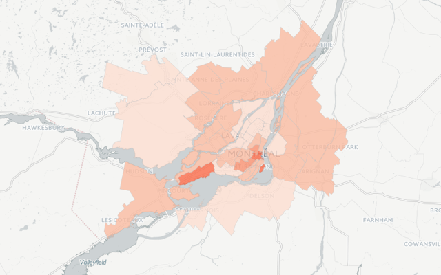
Rent and real estate conditions are fascinating subjects for maps. While they may be the maps that haunt us when in moving-in/out mode, they are likewise the ones that help us mostly clearly comprehend the human, economic, and social landscape of our surroundings.
Read on to continue in our series on Map of the Week posts related to “making rent”, this installment—Montréal.
-
Late last month, we had the pleasure of hosting an event devoted to real-time data mapping, a common request among our community of cartographers and data journalists. For every election map, crisis tracker, or geo-reporting tool, there is a strong need for resources that support consistent data updates and we’re happy to oblige with sync tables as a service in CartoDB.
This event was a kickoff to CartoCamps, a workshop series we’re launching to provide thematic bootcamps that train these common mapping concerns. Read on to learn more and sign-up for future events!
-
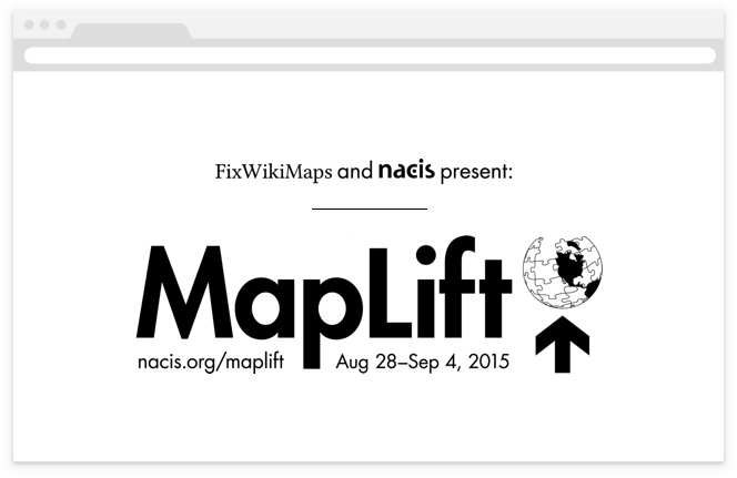
As mappers, you might be familiar with a few theories of cosmology related to how our earth supports itself, the less scientific of them being the most fascinating. In Ancient Greece and Rome, Atlas was the titan who lifted the earth and sky. In A Brief History of Time, the opening anecdote suggests that the earth is flat and supported on the back of a turtle, or a chain of “turtles all the way down”.
While the globes of myth were supported on the shoulders (and shells) of a few, today’s cartography is the crowdsourced result of a world of contributors. We like to think that contemporary mapmakers are building the modern atlas, and resources like Wikipedia support the modern gazeteer. At MapLift you can contribute to both! What’s more, we’ll give you CartoDB support to do so! Read on to learn more about how we’re partnering with NACIS to build a better open gazeteer for the world.
-
As humans, our sense of smell, or olfaction, often triggers the recollection of memorable experiences and the reflexive tuning of our taste buds. How we rectify these triggers with our physical experience informs our response to navigation and often our reaction/attraction to others, areas, and items in our world. In this, the aromatic qualities of our urban landscape absorb a perfume accessory to its inhabitants but often heavily informed by their presence, and ever-important to our experience of geographic space.
A few projects have tackled the geospatial architecture of city scents, and most recently, so has our featured guest blogger. Read on to learn how he built SmellScapes using CartoDB!
-
When we talk about maps in our present, we often forget the intrepid legacy of mapmaking in our past. Some subtle reminders of the struggles behind our geographic sensitivities still hold strong; names like “Mercator” and “Coronelli” echo in our projections and account plans at CartoDB, but rarely do contemporary cartographers think about our own maps as being particularly pioneering, or the product of an adventure.
This week’s featured mapper still holds to the epicness of exploratory maps. Anthony Goddard runs a small project called ZeroSixZero, which builds custom realtime tracking maps for expeditions and adventurers. Read on to learn how he makes maps that track the trails of post-modern pioneers!
-

"When people on airplanes ask me what I do, I used to say I was a physicist, which ended the discussion. I once said I was a cosmologist, but they started asking me about makeup, and the title 'astronomer' gets confused with astrologer. Now I say I make maps."
If you’re a physics buff then you might recognize the above quote as one from Margaret Geller, astrophysicist and author of Einstein-esque zingers. We’re physics buffs at CartoDB. Half of our Community Team earned its formal education in a field that studies the physical properties and phenomena of our world. This makes sense, since folks who build tools to map humanity understandably stem from a fascination with flux in the physical topography of our universe. With the addition of Stuart Lynn, our team of hackers grows to accommodate a pretty brilliant and inquisitive scientist with a background in planet tracking, climate mapping, and studying ‘spooky matter’ of galactic proportions.
Read on to get to know our newest Map Scientist at CartoDB!
-
Early June was a grand month for conferences in the civic tech and mapping scene. Reviewing the online documentation for the Personal Democracy Forum, State of the Map, and the concurrent OKFN meetups reveals a healthy two weeks of activity on the USA-EST front. With so much hyper-local happening, we at CartoDB decided to stay local as a team, and outsource our distant conference attendance to a deserving academic. Two weeks ago, we tweeted asking for the “best mapping visualization in exchange for a free ticket to Eyeo,” and while there were several worthy submissions, one was superior to the rest.
-
In the second addition of our series on clever mapping with GDELT data (see this post from last week), we wanted to take on some more advanced mapping techniques. Again, we welcome Kalev H. Leetaru of the GDELT Project to explain how using geospatial information about journalism can build a better understanding of media in our world! Read on for more!
-
Property values are a persistent obsession for New Yorkers, as are the arbitrary constraints to dwelling well (dwelling? yes). Between navigating the rental quagmire of online listings to toggling the various Trulia, StreetEasy, and Zillow helper services, you can tumble down a rabbit hole of the worst options imaginable (or at least, publishable). In the bizzare world of renting, we can help you through the looking glass.
This Map of the Week features the work of a familiar face to CartoDB, Chris Henrick, who between juggling GIS projects and grad school also co-organizes Maptime NYC. His MFA thesis project “Am I Rent Stabilized?” combines code, maps, and critical thinking about urban planning and renters rights - all of which we love and welcome at CartoDB! He currently lives in Brooklyn, NY, where we locals join him in an obsession with rent rates and regulations. Read on to discover more of the mechanics behind his impressive web app!
-
A short week after our conference celebrating news and maps, and a short month away from State of the Map, we wanted to write and wrap up some of the awesome of GeoJourNews. On May 15th (that is 5/15/15, the best of palindrome days!) we convened over 150 geographers, researchers and mappers to give keynotes and lightning talks on the topic of news maps. We featured 16 speakers, from a few countries and a varied program of newsrooms, attracting the communities of our planning partners at Parson’s Journalism + Design program and Knight Mozilla Open News. We learned, mapped, and built together a program of impressive talks and projects! Read on to learn more!
-
What would it look like to literally map the world’s news as it happens? What if you could reach across a growing fraction of the world’s news media every day, in real time, in 65 languages, and put a dot on a map for every mention in every article, in every language of any location on earth, along with the people, organizations, topics, and emotions associated with each place? That’s the vision that drives the GDELT Project.
In the wake of our GeoJourNews conference, celebrating journalists, cartographers and coders, we have an exciting partnership to announce with GDELT, one that we hope will only further support our community! We welcome Kalev H. Leetaru, a Senior Fellow at the George Washington University Center for Cyber & Homeland Security in Washington DC, to author a guest post demoing how CartoDB can be used to map the world’s news in real time!
-
Take a look at some of the most well-trafficked maps in our gallery and it’s not hard to understand how often data-driven journalism underscores great maps, and how common the contribution of reporters is to our community at CartoDB. To support this growing group of cartographers in newsrooms, we’re hosting a two-day conference in two weeks and you’re invited! Read on to learn more about our schedule, our speakers, and how you can score tickets!

-
This past Saturday, an epic earthquake devastated Nepal, resulting in a profound death toll and an impressive response from the humanitarian and crisis-mapping community.
We’ll be updating this post with continuous maps focused on the Nepal region, the aftermath of the tremors, and the humanitarian response flooding media reports and Twitter testimonies globally. Read on for a summary of some informative maps and some how-tos on embedding maps in your next report.
Updates as of 6/27/15 22:50 EST.
-
In the wake of World Water Day (water puns for the win!), we’re plotting this Map of the Week using CartoDB + OdysseyJS to characterize rivers, and chapterize learning about location via Mexico’s Mississippi: Rios Lerma y Santiago. Read on for more about this rad approach to our understanding of environment, Latin America, and running a river through episodic narrative!
-
This past week, the NYTimes posted an extended piece on mapping county-level lynching data, a topic of interest to some of our academic users and in particularly, Michael Weaver. Michael is a Ph.D candidate in Political Science at Yale University, where he investigates the causes and consequences of ethnic violence.
His dissertation is on how the changing nature of publicity helped turn Americans against lynching, and this week, his Torque map is our Map of the Week. Read on to learn about his research in his own words.
-
This week marks a winter slurry of holiday occasions, including Lincoln’s Birthday (Wednesday), World Radio Day/Friday the 13th (Friday), Valentines Day (Saturday!), and Halfprice-Chocolate Day (aka, Sunday)! In the spirit of the latter (two), we celebrated this week with our community at Monday’s Geo-NYC Meetup, prefiguratively themed “Love Stinks.” Our plan was simple/typical: make some cool maps to give people hope this holiday season. Read on to learn how we did it.
-
On Tuesday evening, President Barack Obama delivered his final State of the Union Address. This year marks the first year that the State of the Union address was made available as full text for perusal and commentary prior to the speech. In the spirit of this openness, we’ve paired a few pull quotes with some awesome maps from our community. This will kickstart a series of blogs wherein we’ll feature 5+ community maps based on a concept or theme.
Skim the speech text here, and follow along below to check out the State of the Union as measured in maps!
