Posts by: Stuart Lynn
-
You might have seen the blog post we produced a little while ago looking at the
L train closure and the possible impact that might have on L commuters to manhattan. One of the most visually striking elements of that post were the maps where we showed walking routes for people in Brooklyn to their nearest L. We did it a few times, once like above showing all people in Brooklyn, and a second time showing cumulative walking corridors for people that live on the L. You might have wondered how we made those lines, so in this post we will show you how. -
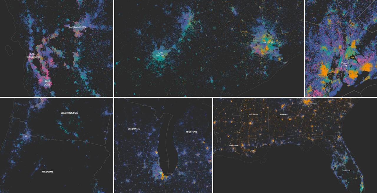
This map shows the distribution of people in the US who have a problem with both their sight and their hearing. It was made using US Census data but if you go looking for sight and vision data in your copy of the US Census files, you aren’t going to find them. How did we make it? In this post we will take you through a quick experiment in using a pinch of public use microdata, a smidgen of machine learning and some inspiration from our friends over at Enigma, to make the US Census reveal to us patterns we’ve never seen before.
-
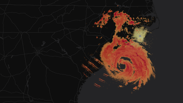
The National Oceanic and Atmospheric Administration (NOAA) has just partnered with Amazon Web Services to make a huge amount of historic and current radar data publicly available. In this tutorial we will show you how to use CartoDB to map this data to explore weather!
-

We’re hosting a workshop in Chicago, IL, this week, and you’re invited! Join us for some geo-fun as we take on the Chi-town civic tech scene.
-

Matt Forrest is a map, transit, and technology enthusiast, and now he’s joined our New York office as our new Account Manager. Matt will put his business, project management, and consulting experience to work as he helps our customers analyze their data and build applications with CartoDB.