Category: Customer stories
-
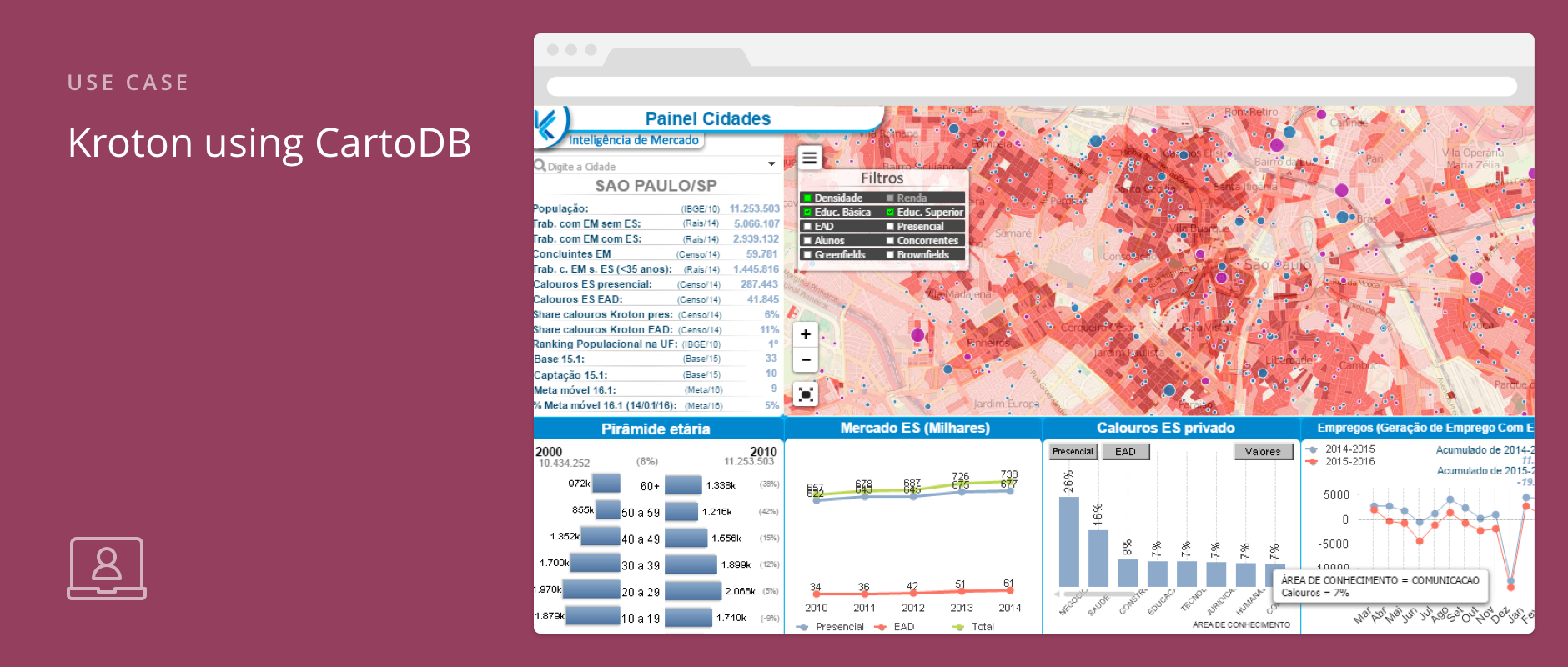
When your organization has locations all over the country, or world, sometimes it’s hard to keep up with the progress of different targeted marketing campaigns. How you analyze all that data to determine the impact your organization is having (or not), makes all the difference in coordinating your next move.
-
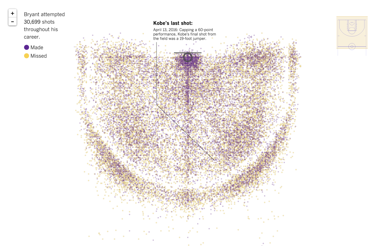
On April 13, Kobe Bryant played his last game of his 20-year career and, in great form, scored 60 points! Fans from Los Angeles, and the world over, were saddened to see the Black Mamba go, but his shooting record will live on in history, and now as a visualization. The LA Times mapped all of Kobe’s career shots using CartoDB and Python. The NBA data-driven visualization, charts every shot ever taken by Kobe - roughly 30,699 (data) points. How many points did he score in his lifetime? For those of you keeping count: 33,643 points.
So how exactly did the LA Times do it?
-
Every day large volumes of location data are generated by social networks, remote sensing, and mobile devices. For quite some time, Geographic Information Systems (GIS) has been used as the standard tool to manage and analyze this type of geo-referenced data. However, GIS tools have always been oriented towards professionals in geomatics than to the general public, creating a barrier to real insights and data analysis.
-
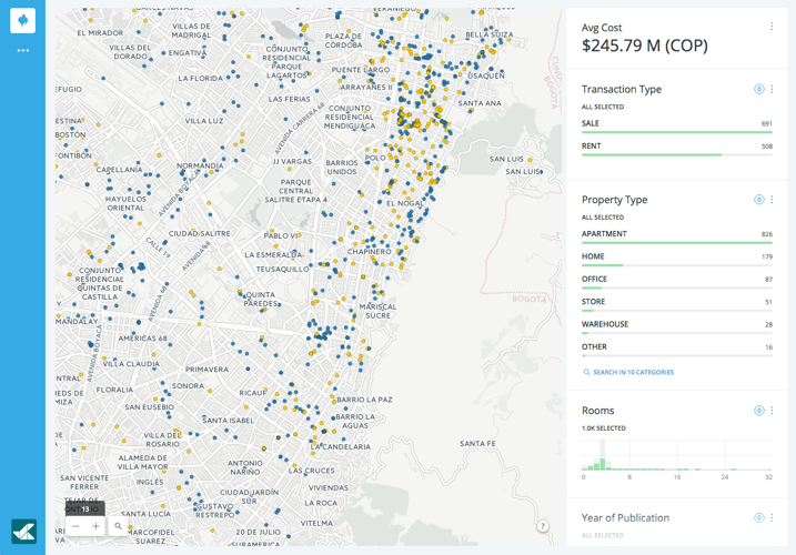
We absolutely love client success stories that make use of big data and provide great insights for customers all over the world. In this case, the insights are for one of the fastest growing global fields, real estate.
-
Last night the Carolina Panthers were smothered by the Denver Broncos in what ended in a two-touchdown lead game. How did the U.S. react? What did they think about that last call on possession? Will we ever come to a consensus on whether Beyonce stumbled during her performance?
-
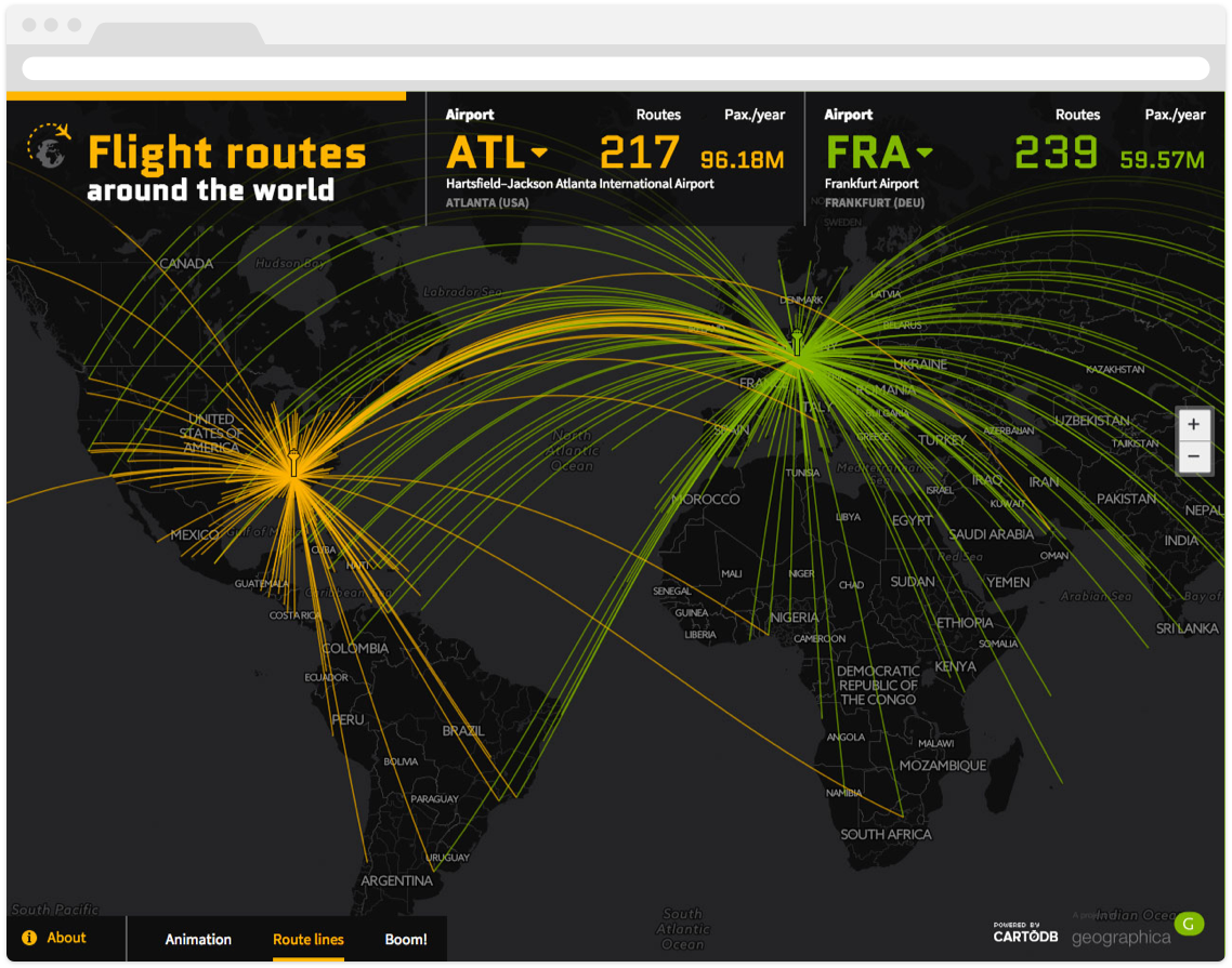 What’s the busiest airport in the United States? That simple question led Geographica on a path to insights and analyses of airports and flights all around the globe. Geographica specializes in software solutions to sort, analyze, and visualize data. Using CartoDB, they developed a data-driven visualization to derive insights on thousands of data points.
 -
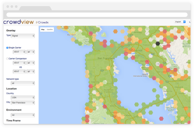
Wait… My call’s dropping… I think my phone is breaking up. Darn it! I’m not getting any wifi signals so all my iMessages are turning into green SMS texts instead of the placating blue. Many telecommunications agencies work relentlessly to provide solutions to many of these and other customer related problems.
-
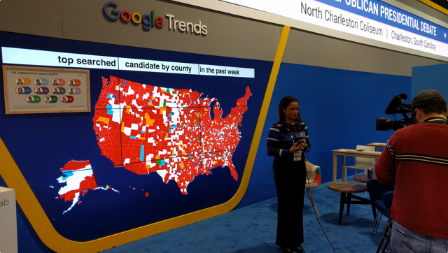
With less than a month away before the first U.S. presidential primaries, all eyes are on the headlines for the latest jabs by Trump, Hillary, and the gang. Just how do journalists get the spin on the topics and trends this election season?
-
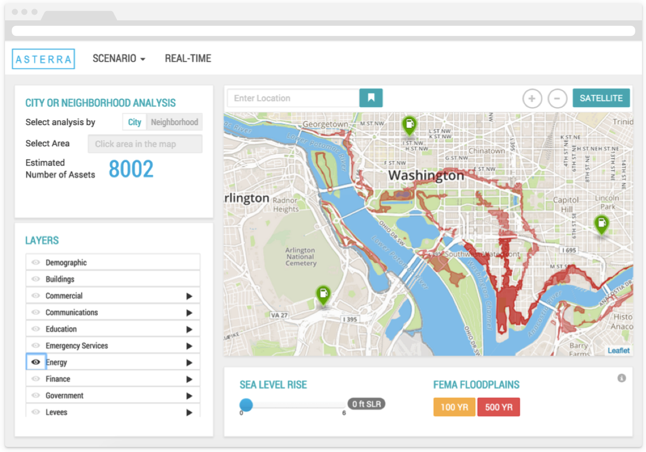
After COP21, it is expected that more and more cities will work towards implementing a solution to climate changes that have adverse affects on infrastructure and populations.
A CartoDB partner, Vizonomy, created a risk platform analysis dashboard, using open government data - for this specific reason. The dashboard allows communities and businesses to see infrastructure and populations vulnerable to a rise in sea level and flooding.
-
Real estate is a great sector to leverage deep insights using location intelligence. Properati, a property search portal with a strong presence in Latin America, aims to improve the experience of purchase, sale and rental of real estate. Currently the site operates in Argentina, Brazil, Chile, Mexico, and Colombia with over one million properties listed.
-
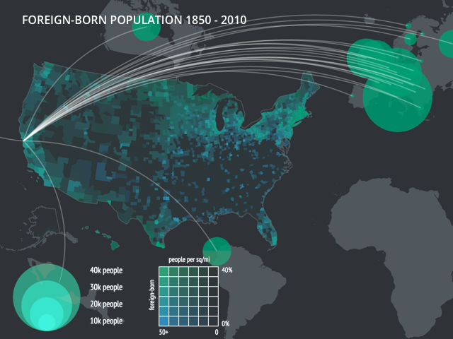
When Charles O. Paullin and John K. Wright created The Atlas of the Historical Geography of the United States in the 1930s, they made the best atlas they could given the tools at their disposal. Standing on the shoulders of giants, they could see further than this, and dreamed aloud that “the ideal historical atlas might well be a collection of motion-picture maps, if these could be displayed on the pages of a book without the paraphernalia of projector, reel and screen,” but didn’t have the technology to make it happen in the 1930s.
Today we have that technology. The University of Richmond’s Digital Scholarship Lab and Stamen Design, with the support of Andrew W Mellon Foundation, have launched a new project, called American Panorama, that aims to realize that vision of the “ideal historical atlas”. American Panorama includes a new suite of data visualization tools for students, scholars and researchers to easily create data-rich, interactive maps of change over time and space.
-
Location data is paramount to intelligent cities planning and development. Geographical information provides a common frame of reference and big picture analysis for entrepreneurs, citizens and policymakers alike.
-
Planet Labs, Github, Vizzuality and CartoDB, have come together to use #LoveEarth to motivate communities on Facebook and Instagram and, to amplify the social movement around global climate change and the Paris Climate Summit - COP21, which will be convening leaders from all around the world.
-
Data-driven visualizations are a compelling method to engage audiences in some of the most unconventional ways. How exactly does charting the musical preferences of your global users turn into one of the most web trafficked visualizations on your platform?
Spotify, an award-winning digital music service, fused geographic analysis and user data to discover musical trends all around the world and increase brand awareness through a cost effective solution!
-
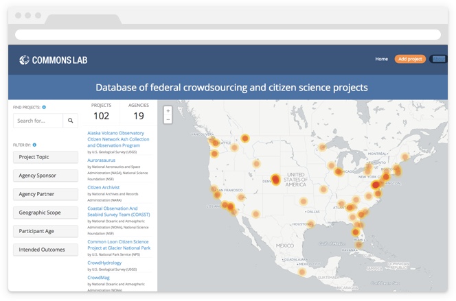
Amidst the growing number of civically engaged public events, federally led hackathons, and public development projects, the question has arisen, where can all these projects and information sources be consolidated?
-
Businesses and real estate agencies can save time and money by adding spatial analytics to their intelligence systems. Location analysis can provide insights that support and improve decision making from marketing to supply chain logistics and operations. Rilos, an international business-to-business company, fused business intelligence and geographic analysis to discover powerful new insights. Now that’s location intelligence.
-
From real estate and government organizations, to the financial sector—location intelligence is used by many industries to uncover a myriad of insights in big data. Media and Creative agencies can also harness the power of insight and uncover many secrets through a great data-driven visualization for increased brand engagement and international exposure.
-
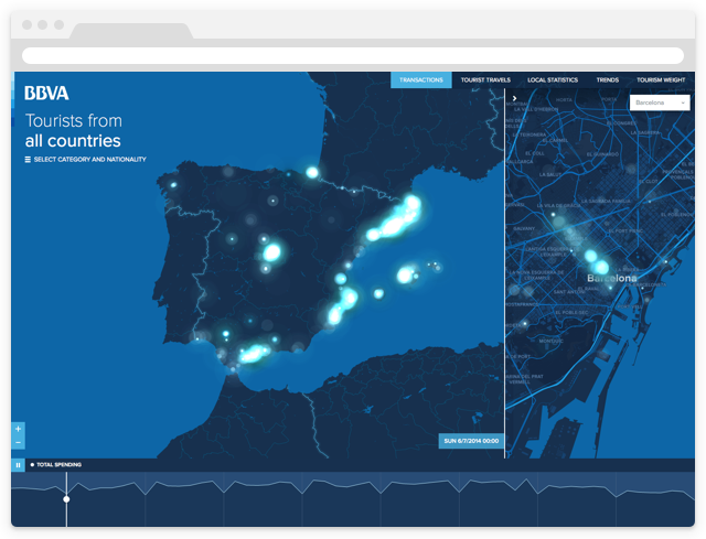
Spain is the number one tourism country in the world. With sights like the Museo del Prado and Royal Palace of Madrid, it is hard not to see how such spectacular beauty could ever be overlooked.
To assist in visualizing the majesty of this European gem, Vizzuality and CartoDB are proud to announce our latest release: an interactive tool to analyze tourist spending in Spain during the summer of 2014. Using BBVA Data and Analytics, you can see how tourists of different nationalities spent their time in Spain. Take a look at this UN-BBVA-LIEVABLE visualization and welcome guest blogger, Jamie Gibson from Vizzuality!
-
Real estate is an industry that relies heavily on data-driven insights and visualizations. Agencies, listing services, property departments all choose CartoDB to visualize their business and make insightful decisions.
-
About a month ago, we announced Insight, our first ever data and design competition in conjunction with Measure, a New York City exhibit by Storefront for Art and Architecture. With the competition close at the end of last month, we wanted to thank all of the teams who submitted projects and emphasize that we were truly blown away by the quality of maps and insight shared by our stellar community. With over 60 incredible submissions, our team spent days deeply exploring each project and deliberating in selecting the top 5 most outstanding projects to enter into our finalists round. CartoDB is proud to announce our Insight: A data and design competition finalists for 2015!
-
The ‘smarter city’ is all the rage, and while a buzzing megapolis may have the complexity and resources to deploy a mayoral ‘geek squad’ or install flocks of sensors, the average town has to fulfill its duties on a much tighter budget.
We’re all about tools that bring location intelligence to everyone, which is why a new product from our partner AppGeo has us excited. They just launched the next generation of MapGeo, a data management and visualization platform for local governments. They’ve rebuilt it from scratch using CartoDB, and, if we may say so, MapGeo 2.0 is fantastic.
If you’re interested learning more about what MapGeo can offer your town or city, we hope you’ll join our October 8 webinar.
-

CartoDB prides itself on helping empower organizations and people to achieve great things and make the world a better place. Our ever-growing climate and non-profit grants have provided innovative organizations with tools and infrastructure to have meaningful impact from the neighborhood all the way up to the world.
-
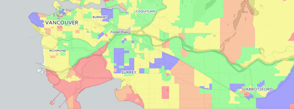
Last week CartoDB had the pleasure of speaking with entrepreneur and real estate map guru Dan (Vadim) Marusin. He is the founder of EstateBlock, a Vancouver Canada based real estate search engine startup powered by CartoDB! Dan discovered CartoDB out of a need to provide easily accessible, high quality, data-secure interactive maps to provide his clients something that had not been done before in Vancouver: provide in-depth and easily accessible insight to home owners and buyers. Below, Dan shares his story.
-
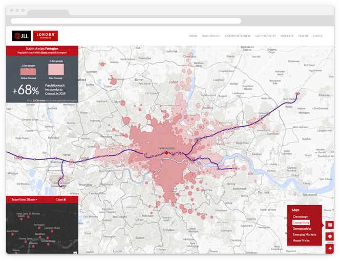
Explore all the varying possibilities of London business infrastructure with GROW.LONDON, a geographic visualization tool developed to help businesses and investors identify key areas to invest in, grow, and expand in the London metropolitan area. Using the power of CartoDB, GROW.LONDON is mapping toward a global urban future where knowledge of diversifying business analytics helps make better decisions and better cities. By visualizing different sets of data using CartoDB’s platform, it’s possible to make accurate business predictions that will likely frame the landscape and competition of an ever enterprising city.
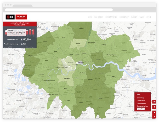
"The GROW.LONDON project had a set of complex requirements. One of them was the capability to easily update some of the maps. In a typical scenario, we would have had to create a complex and expensive back-end interface; with CartoDB, however, this possibility comes right out of the box and allows us to readily manipulate data on hover and on click. Our client can use the built-in user interface to update and test the data for all the maps in the project." Manuel Timita, Founder of Illustreets.
-
This past Sunday was election time again in Spain. Every four years people head to the polls for a regional and municipal election that often foreshadows what is to come in the national election held later in the year. Nowadays these events are considered much more than mere voting—they’re true milestones in the story of a nation and generate huge amounts of data powered by media outlets and social media networks.
Against this backdrop maps are not only a way to show voting results, political differences between regions, and possible political coalitions, but also a dynamic & interactive tool to visualize and analyze poll predictions and real-time results. We’re proud to have been chosen by some of the most important Spanish media outlets to create election coverage maps, and are excited to share them with you. Please keep reading to explore the different projects we were working on over the weekend, and to see the evolution of the Spain’s political map!

-
Many things herald the long-awaited arrival of spring - sunnier weather, leafier trees - but no springtime event is more exciting to baseball fans than Opening Day! On an appointed day in April, all 30 Major League Baseball teams open the new season enthusiastically with 15 back-to-back ball games.
While our Madrid office tends to pay more attention to another kind of “‘bol” sport, this year’s MLB Opening Day was super exciting for us in CartoDB New York because MLB asked us to create a series of Twitter maps for each and every opening day game! How often does baseball and cartography collide?! Mapping Tweets for each team’s hashtag during their game turned out to be a great way to visualize the ferverous excitement of fans and even uncover some interesting stories. Take a look at what we found!
-
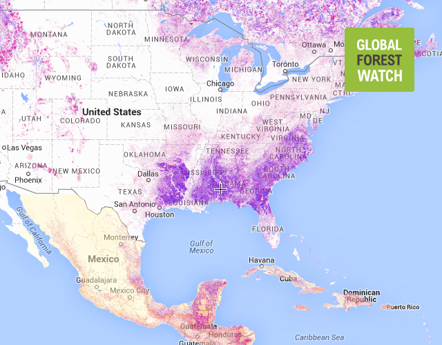
Global Forest Watch and Vizzuality have come together to make visualizing ecological data in maps that much more useful and effective. CartoDB is excited to take part in GFW’s mission in forest preservation.
-
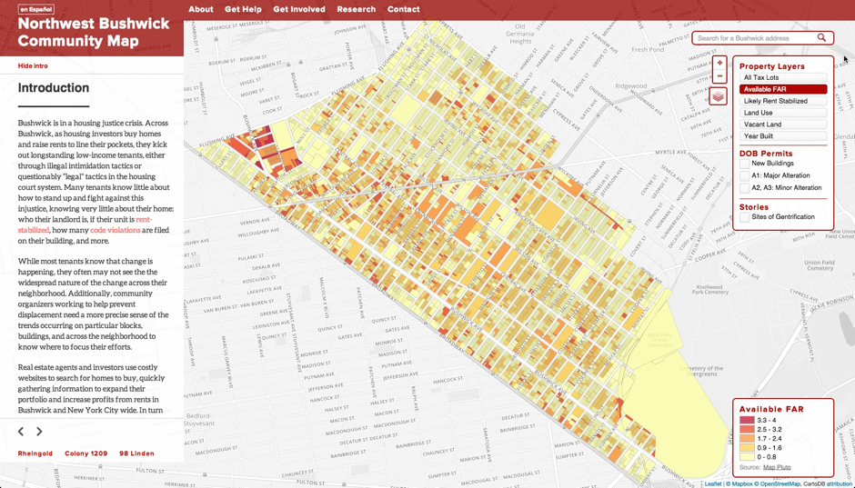
Today we hear from a friend from our NYC community, Chris Henrick. Chris is a MFA Design & Technology graduate student at Parsons, The New School For Design. He is a long time user and an expert on CartoDB. We recently saw The Northwest Bushwick Community Map, a project he has been developing to document ongoing change in one of our communities. We wanted to hear more! Read Chris’s description of the project below.
-
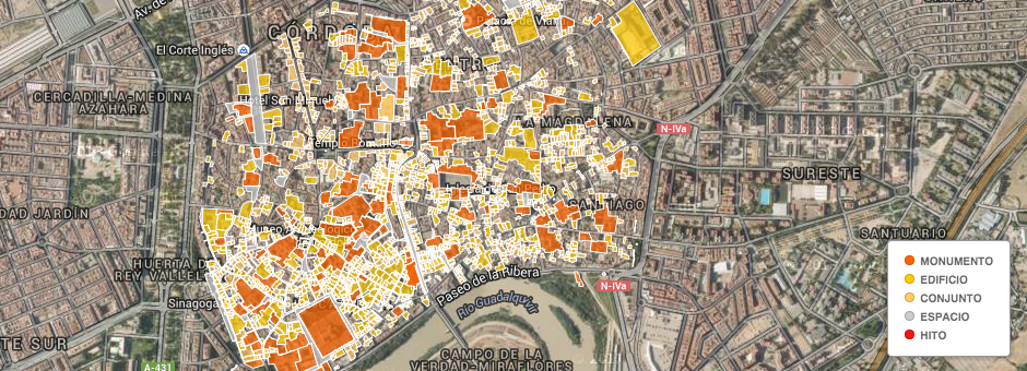
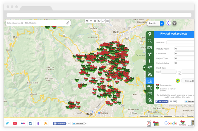
In Southern Spain there is a city that was once the capital of Hispania Baetica during the Roman Empire. At present it is well known because of its incredible cultural and monumental patrimony: Cordoba, in the community of Andalusia. Thanks to its historic legacy, the old town of Cordoba was recognized in 1994 as a World Heritage Site (the Mosque-Cathedral and also to all the streets and buildings around it).
In this blog post we show you how the Urban Planning Department of the Cordoba City Council, fulfilling one of the main objectives of providing information to citizens in a simple and comprehensive way, has made use of CartoDB to visualize important data of the area.
-
Every single day we see a huge influx of beautiful maps created using CartoDB. The topics range from everything from the best places to live in the UK to seismic activity in the depths of Iceland. We decided to compile a list of some really cool maps done by huge media outlets in the last couple of days.
-

More Odyssey.js stories keep popping up from different parts of the world. Here are some recent examples:
-
Following the release of the new Odyssey.js tool to create map based interactive stories, here you have some projects that are already using it:
-
We welcome Dani Latorre in this guest post to let him tell us about a little project in which he has used CartoDB as part of the development. Stay tuned for more stories like this, and if you want, just write and tell us your stories@cartodb.com
-
It didn’t take long after the Superbowl ended for there to be an awesome visualization of all the Twitter activity during the game. The visualization uses CartoDB’s Torque library to show over 1 million tweets in just 6 hours.
-
A new series of maps have been published on the Internet Archive’s blog showing the location and frequency that US television news has mentioned places around the world. You can see the original blog post here, Mapping 400,000 Hours of U.S. TV News.
-
The Humanitarian OpenStreetMap Team (HOT) has been working hard to mobilize a large number of volunteers to digitize areas of the Philippines in order to help aid efforts. We put together this map to show the results of that great effort.
-
Last week was the international FOSS4G meeting, one of our favorite conferences of the year. We told you a few weeks ago about some of the things we would be presenting at the meeting. Something we forgot to mention was that this year they did something completely new called, “Opening Up The Map”. In short, it was a community generated gallery of some of the best maps coming from the open source community.
-
Earlier this week we saw this amazing blog post from LifeWatch, where they map and analyze the life of a seagull. The blog post comes out of a project that tracks, in real-time, 30 birds using solar powered GPS units. From those 30 birds, the authors single-out Eric,
-
In this guest blog, Manuel Timita and Katya Koval describe how they are building one of the most interesting real estate business intelligence tools available with Open Data, Illustreets. We are very impressed on their usage of the entire CartoDB platform, from the Maps API to the SQL API is an example of the complete type of Data Products you can build with CartoDB. We got the opportunity to meet Manuel during last FOSS4G in Nottingham and the passion they have put on their product is unmatched. We love what they are building and cant wait to see the new functionalities they come up with. Enjoy!
-
Last weekend there were elections in Germany, and that means a lot of mapping! Maps are a fundamental tool to explain voting results, differences between regions, possible coalitions, and more. And during election night they become one of the most fundamental visualization techniques for showing the status of results.
-
In this guest blog, Tim Robertson describes how the Global Biodiversity Information Facility (GBIF) are building a dynamic density map with 0.5 billion tiles and supporting 40,000 tile updates per second using components of the CartoDB stack for their forthcoming portal. This is the first time the CartoDB stack is connected to an HBase / Hadoop backend to handle large data volumes and velocities. It is a great example on the upcoming configurations we will see of CartoDB connected to Big Data sources.
-
Today we are pleased to publish a post from Greg More, founder of OOM Creative. We saw some of the maps being created by Greg and his team for the City of Melbourne and knew our users would be interested in the project and process. Enjoy!
-
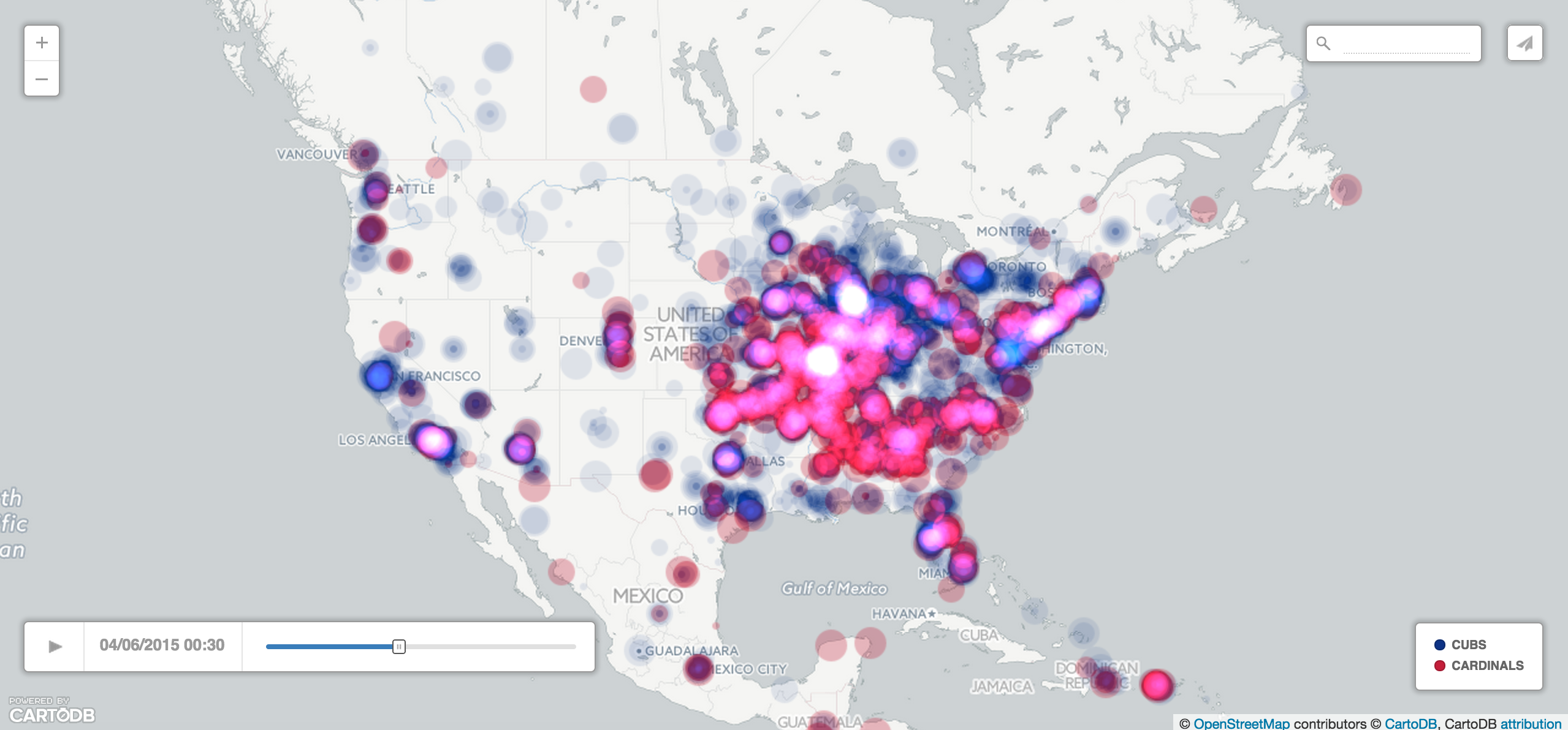
In our second post this week about Twitter visualizations, we want to show you a cool visualization of tweets from throughout the NBA Finals visualized using CartoDB. Like the Wimbledon map we showed you yesterday, this map makes use of a neat set of ~70,000 geospatially tagged tweets. The tweets are visualized in two distinct ways. In the first map, all tweets are displayed by location and with a color according to the team the tweet identifies with,
-
Today we hear from Steven Romalewski in a guest post detailing work on the “Who Represents Me: NYC” project. Steven has created several projects using CartoDB, generally focused on topics in the NYC area. We think his work is interesting to people anywhere though! We’re happy to let him share his work with you here.
-
From its beginning, CartoDB been a powerful tool for journalists because it’s easy, flexible, scalable and open source. With this simple-to-use tool journalists everywhere are discovering the immense power data visualization gives them for research and telling stories.
-
Even though our blog gives a lot of attention to maps, CartoDB is a great tool for a lot more than just maps. We have seen in the past how the CartoDB APIs can do all sorts of dynamic queries to CartoDB hosted data. While dynamic queries CartoDB can be geospatial in nature, even returning GeoJSON formatted results, we haven’t spent much time highlighting the fact that they don’t have to be geospatial. That is why we are excited by the latest project released by the Climate Policy Initiative, the Policy Climate Interactive.
-
As some of you may already know, Newsweek / The Daily Beast has been using CartoDB for some time now, and as such today’s blog post comes from Michael Keller of Newsbeast labs. We’d also like to take the opportunity thank Michael for his amazing contributions to the CartoDB community. Thanks!
-
Over the past months you have probably come to realize, we love data that moves. Moving data can make your maps and visualizations really come to life and data you can use to build these visualizations can come in a lot of forms. Whether it’s data that crawls and zips across a map through time, data that bursts and comes to life as you watch, or data that changes form or intensity, it all can lead not to some really amazing visualizations.
-
We recently announced a “Show up your maps” initiative to see and share with the community the types of things CartoDB users were building. Thus far we’ve had some pretty cool responses and while we’d love to show you all of them, we’ve for the time being selected three projects.
-
The horrific shooting occurred on July 20 in Colorado has reignited the debate in US over gun control. How bad is the problem?, asks The Daily Beast in a new piece of data journalism based on a list of 431 shootings in US with more than one victim since 2005.
-
Online activists are having a key role documenting the ongoing civil war in Syria. As this terrible war unfolds, they are posting dozens of videos and live streams on the internet, and curating data to fight the so-called “electronic war”.
-
This week, The Wall Street Journal rolled out its Political Moneyball graphic, a visualization of the connections between political action committees, super PACS, campaigns and individuals. Based on the latest official Federal Election Commission data for the 2012 election, the project visualizes more than one million connections between donors and committees. The data is updated every month.
-
This year marks the twentieth anniversary of Restaurant Week in New York City, and in order to commemorate its longevity, the dining celebration has been extended to a very un-weekly 20+ days, creating a somewhat good problem for New Yorkers to have.
-
Doctors of the World is a healthcare and humanitarian aid charity working worldwide to provide solutions that improve health and save lives. Its Spanish branch is launching this week the campaign “The health virus”, an initiative to raise awareness of the global right to health focused on the maternal health challenge —every two minutes, a woman dies from complications related to pregnancy.
-
The Wall Street Journal (WSJ) published today its first interactive map on the 2012 election. The map is part of an ongoing, regularly updated full election coverage. All data analysis and storage is done with CartoDB. The final election map is built through CartoDB API’s and the Leaflet map library.
-
In 1943, four NYC newspapers published a local market analysis aimed at advertisers. The document was based on the 1940 Census and included hundreds of photos & color-coded maps portraying the geographic patterns of monthly rent levels across the city. It also featured statistics and short narratives about the neighborhoods.
-
Which are the blocks in New York City that had the most New York Police Department stops in 2011?
-
If you live in NYC, you’ve probably heard about a new bike-share program that will come to life this summer. The program will be launched with around 420 stations and is scheduled to grow to some 10,000 bikes and 600 rental stations throughout the city by summer 2013.
-
In United States there is quite a discussion about redrawing legislative district lines. The Center for Urban Research in New York together with The New York World have developed some comparison maps. They have used CartoDB to develop those maps and we would like to share the link to the application as we think is really interesting comparison technique. Steven Romalewski has written a blog post about it.
-
Today we get the surprise of a really interesting visualization developed using CartoDB. Diego Valle has done this powerful visualization about the drug war in Mexico.
-
In The last 2 weeks a lot of new applications have been developed at #ecohacknyc, #nycbigapps and #sciencehackday using CartoDB, pretty excited. This demonstrates the power of CartoDB specially for fast development of location aware applications and mapping. We are gonna be highlighting different applications that make use of CartoDB on the next days.