Category: Map of the week
-
This past Tuesday marked the 111th anniversary of the New York City Subway, an iconic transport system which to-date has the most active stations of any underground system in the world. Subways operate in over 55 countries globally, throughout a growing collection of 150-some cities; and the art of mapping subterranean transit continues to fascinate information designers and commuters alike.
This past week, Cooper Union hosted a sold-out event called “The Subway Map: The Last 50 Years, The Next 50 Years” for a packed crowd of New Yorkers, and in honor of this, we’ve assembled a quick collection of some of the most interesting subway maps in CartoDB, along with a little tutorial on using subway data in your own maps.
-
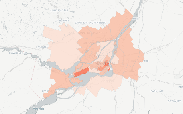
Rent and real estate conditions are fascinating subjects for maps. While they may be the maps that haunt us when in moving-in/out mode, they are likewise the ones that help us mostly clearly comprehend the human, economic, and social landscape of our surroundings.
Read on to continue in our series on Map of the Week posts related to “making rent”, this installment—Montréal.
-
As humans, our sense of smell, or olfaction, often triggers the recollection of memorable experiences and the reflexive tuning of our taste buds. How we rectify these triggers with our physical experience informs our response to navigation and often our reaction/attraction to others, areas, and items in our world. In this, the aromatic qualities of our urban landscape absorb a perfume accessory to its inhabitants but often heavily informed by their presence, and ever-important to our experience of geographic space.
A few projects have tackled the geospatial architecture of city scents, and most recently, so has our featured guest blogger. Read on to learn how he built SmellScapes using CartoDB!
-
When we talk about maps in our present, we often forget the intrepid legacy of mapmaking in our past. Some subtle reminders of the struggles behind our geographic sensitivities still hold strong; names like “Mercator” and “Coronelli” echo in our projections and account plans at CartoDB, but rarely do contemporary cartographers think about our own maps as being particularly pioneering, or the product of an adventure.
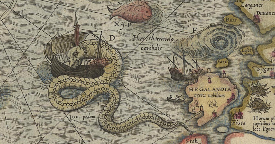
This week’s featured mapper still holds to the epicness of exploratory maps. Anthony Goddard runs a small project called ZeroSixZero, which builds custom realtime tracking maps for expeditions and adventurers. Read on to learn how he makes maps that track the trails of post-modern pioneers!
-
Property values are a persistent obsession for New Yorkers, as are the arbitrary constraints to dwelling well (dwelling? yes). Between navigating the rental quagmire of online listings to toggling the various Trulia, StreetEasy, and Zillow helper services, you can tumble down a rabbit hole of the worst options imaginable (or at least, publishable). In the bizzare world of renting, we can help you through the looking glass.
This Map of the Week features the work of a familiar face to CartoDB, Chris Henrick, who between juggling GIS projects and grad school also co-organizes Maptime NYC. His MFA thesis project “Am I Rent Stabilized?” combines code, maps, and critical thinking about urban planning and renters rights - all of which we love and welcome at CartoDB! He currently lives in Brooklyn, NY, where we locals join him in an obsession with rent rates and regulations. Read on to discover more of the mechanics behind his impressive web app!
-
Guest post by Laura Allen
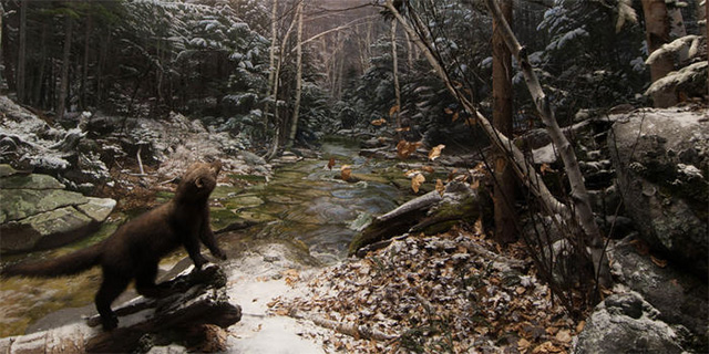
When I pitched my article Keeping up with the Carnivores for JSTOR Daily on the encroachment of predators into urban America, I knew that one of my favorite carnivores, fishers, were perfect for the story. Fishers are slinky members of the weasel family that have bounced back in recent decades from historic hunting pressure.
In 2012, when I was writing new interpretive panels for the restored dioramas in the American Museum of Natural History’s Hall of North American Mammals (you know it—the one with the big brown bear), I learned from mammalogist Roland Kays that fishers were no longer confined to deep evergreen forests as in the White Mountains, NH scene depicted in the 1950’s-era diorama below.
-
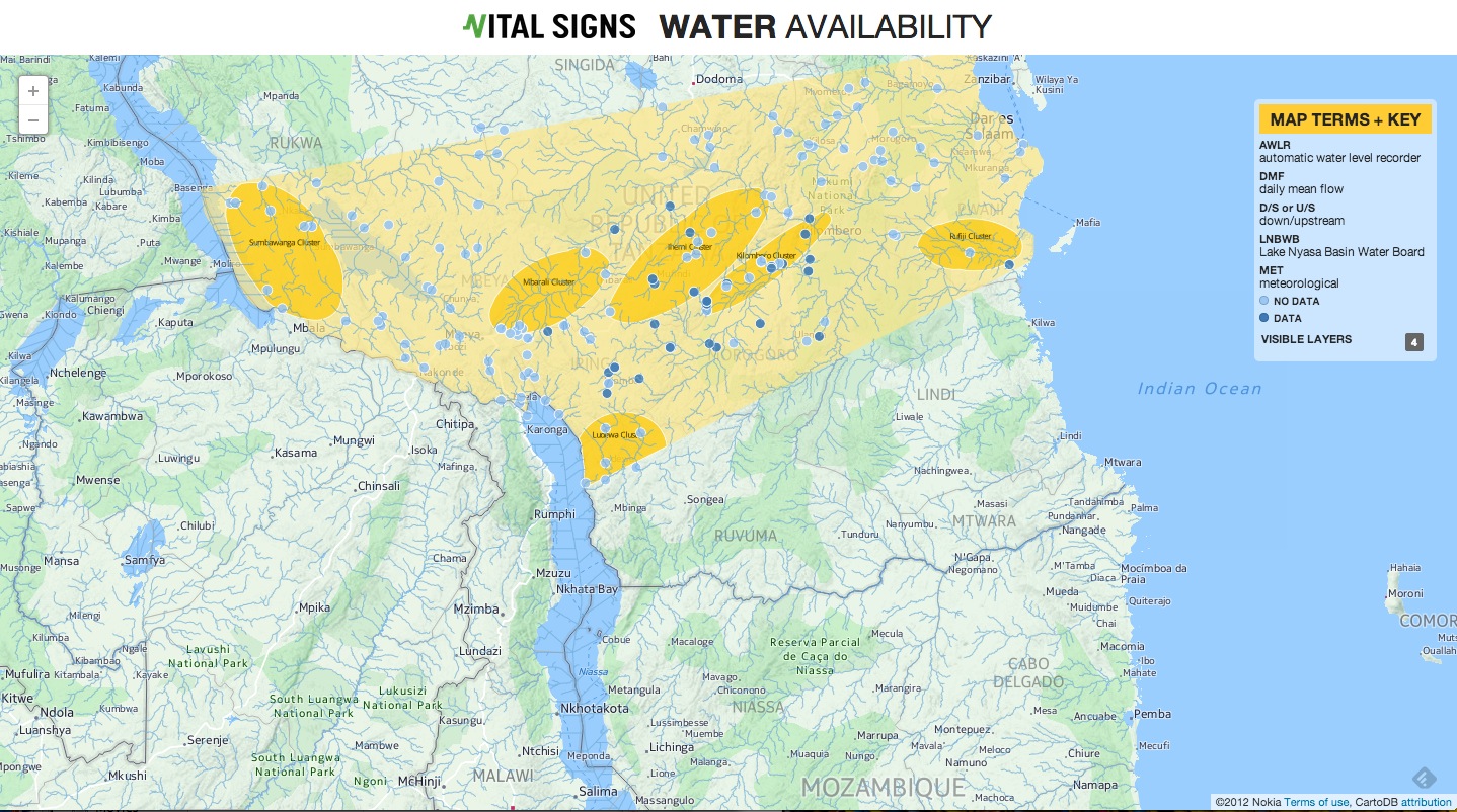
In the wake of World Water Day (water puns for the win!), we’re plotting this Map of the Week using CartoDB + OdysseyJS to characterize rivers, and chapterize learning about location via Mexico’s Mississippi: Rios Lerma y Santiago. Read on for more about this rad approach to our understanding of environment, Latin America, and running a river through episodic narrative!
-
When Sade sang in ‘Smooth Operator’ – “Coast to coast, LA to Chicago” – she obviously hadn’t consulted a map.
For starters, L.A. - Los Angeles (not to be confused by the abbreviation of Louisiana, a southern U.S. state) is on the coast but what about Chicago? Only if you count the coast of Lake Michigan.
-
This past week, the NYTimes posted an extended piece on mapping county-level lynching data, a topic of interest to some of our academic users and in particularly, Michael Weaver. Michael is a Ph.D candidate in Political Science at Yale University, where he investigates the causes and consequences of ethnic violence.
His dissertation is on how the changing nature of publicity helped turn Americans against lynching, and this week, his Torque map is our Map of the Week. Read on to learn about his research in his own words.
-
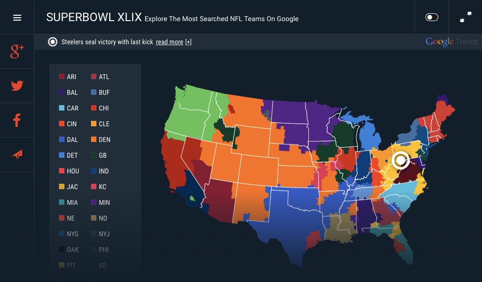
In case you were trapped on a moutain, in a blizzard so thick you couldn’t see your hands in front of your face, and just got back to civilization this morning, let us say the Superbowl happened last night. The team from the East Coast beat the team from the West Coast in a game where many fans held their breath until only 10 seconds were left.
If you love football, or if you don’t love football but you love maps, we want to show you a couple of maps that use CartoDB to show us some neat things about the Superbowl last night.
-
As many know, CartoDB’s commitment to elevating efforts in conservation, climate change, and the environment has shaped our practice and given way to many exciting mapping projects such as the creative and impressive Carbon Calculator and the Global Forest Watch Map that allows users to monitor deforestation in real time.
-
On Tuesday evening, President Barack Obama delivered his final State of the Union Address. This year marks the first year that the State of the Union address was made available as full text for perusal and commentary prior to the speech. In the spirit of this openness, we’ve paired a few pull quotes with some awesome maps from our community. This will kickstart a series of blogs wherein we’ll feature 5+ community maps based on a concept or theme.
Skim the speech text here, and follow along below to check out the State of the Union as measured in maps!
-
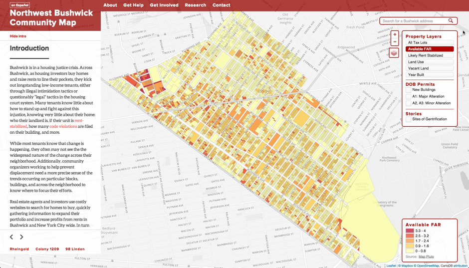
Today we hear from a friend from our NYC community, Chris Henrick. Chris is a MFA Design & Technology graduate student at Parsons, The New School For Design. He is a long time user and an expert on CartoDB. We recently saw The Northwest Bushwick Community Map, a project he has been developing to document ongoing change in one of our communities. We wanted to hear more! Read Chris’s description of the project below.
-
In exactly one year from today, the force will re-awaken with Star Wars: Episode VII. Until then, get caught up on humanity’s favorite space saga with this comprehenisive map of the Star Wars galaxy:
-
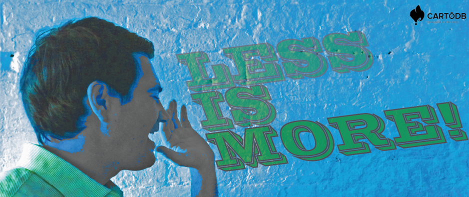
In the big, complex world of mapping data, it’s often easy to forget the significant impact that simple and elegant visualizations can have. For this reason, we are proud to announce our new map series Less Is More! Our new series brings together strikingly simple map designs that tell big, impactful stories. Click here to check out the series!
-
Welcomer Aurelia Moser (@auremoser) to our Map of the Week series. She is a developer for Knight Mozilla Open News in Brooklyn, NY. She has worked on projects for Ushahidi and Internews Kenya, building interactive visualizations to support data journalism and crisis mapping globally. Find her at algorhyth.ms, and listen in for her radio show based on the semantic web at Stereo Semantics.
-

RocketMill are a digital marketing agency working on behalf of Caring Homes, a leading UK care home provider. As businesses, they share similar values: they are people-centred, value transparency and are both innovative. This interactive data graphic is completely in line with these values. Krystian Szastok was the project leader and the creator of the map and concept.
-
We welcome Laura Kurtzberg, Data Intern at ecoLab, to our Map of the Week series. Kurtzberg work on the InfoAmazonia project along with other online undertakings. She cares about using Internet technology for humanitarian and environmental causes.
-
We welcome Pedro Cuhna to our Map of The Week series. He’s a developer currently working in Startup Institute as a freelancer. Check some of his work here.
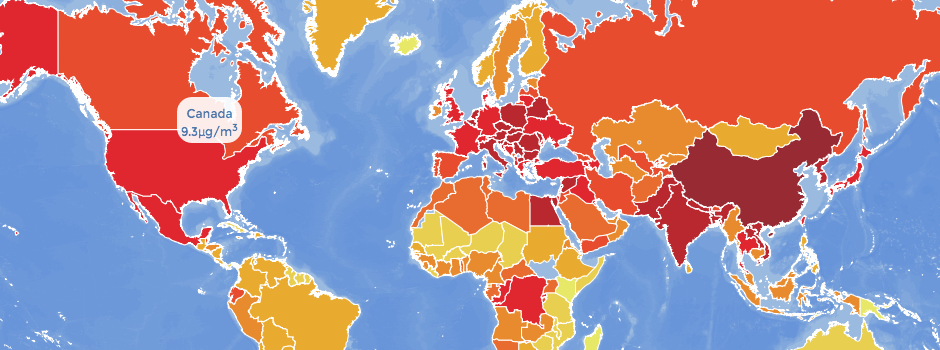
Cunha created an interactive map with Dmitry Pavluk, Anna Young, and Diego Torres Quintanilla to provide a baseline understanding of air pollution around the world. The map was published by The Atlantic magazine
-
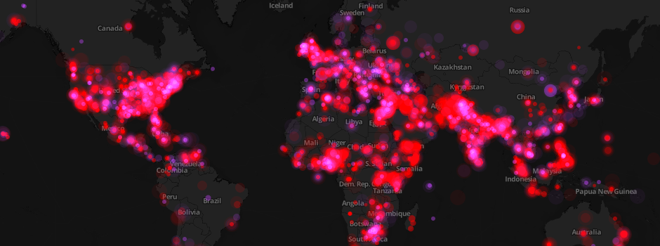
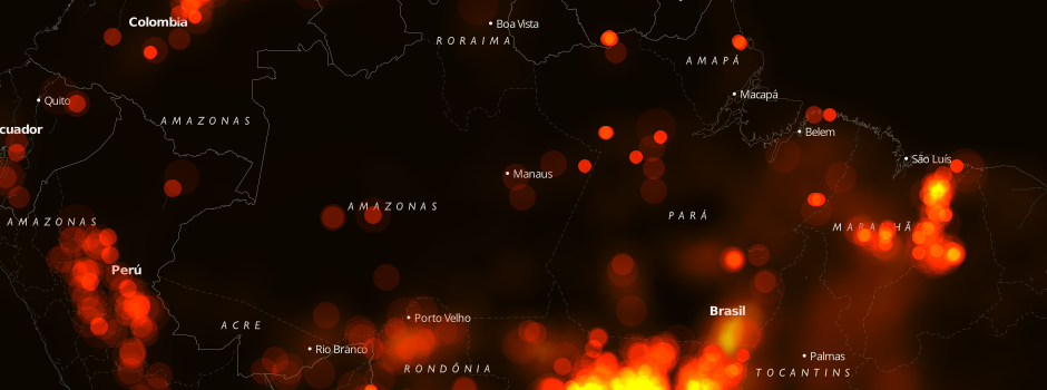
Welcome Kalev H. Leetaru, a fellow and adjunct faculty in the Edmund A. Walsh School of Foreign Service at Georgetown University in Washington DC. In this guest post Kalev talks about how he used CartoDB to create a map of global conflict that updates every morning.
-
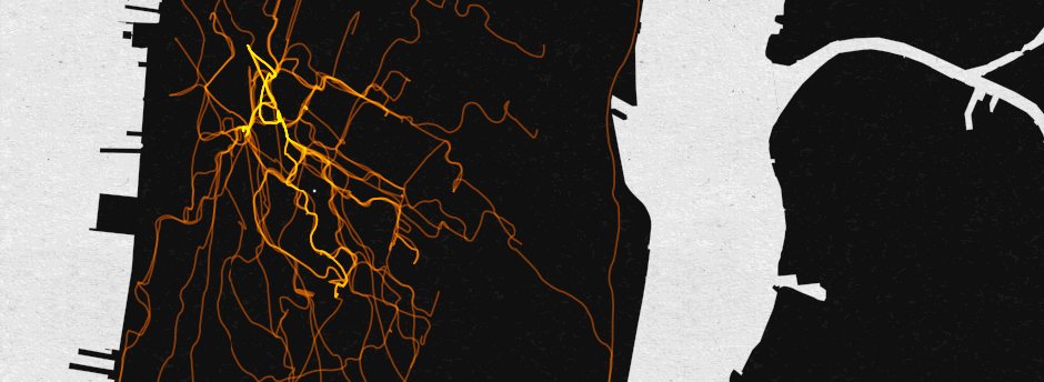
Welcome Miles Grimshaw to our Map of the Week series. Miles has used Kimono Labs and CartoDB to visualize one year of his Citibike trips (the bike service in New York City). Here is the result.
-
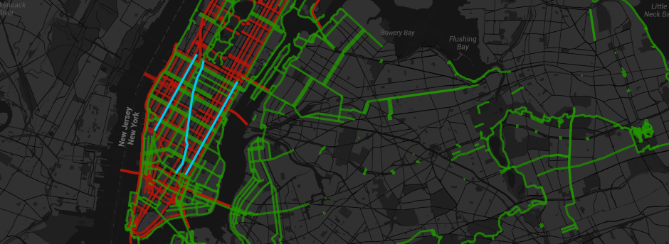
We welcome Jeff Jenkins to our Map of the Week series. Jenkins is a cyclist, board gamer, and software engineer living in New York City.
He decided to take NYC’s data on truck routes and overlayed it onto a map with bike lanes to prove that there is a need for better southbound bike lanes in central or eastern Manhattan.
-

We welcome Timo Grossenbacher to our Map of The Week. He’s currently working as Interactive News Developer at the Swiss daily newspaper Tages-Anzeiger, based in Zurich.
-

Welcome Sarah Ryley to our Map of the Week series. Sarah is the data projects editor at the New York Daily News, which has the second-largest newspaper website in the United States. Crime reporting is the bread and butter of the Daily News, so Sarah has been focused on making crime data interactive and accessible to the publication’s millions of readers.
-
We welcome Nacho Ormeño to our Map Of The Week series. Ormeño is a co-founder of Startupxplore, a global platform created to connect and promote the blooming startup community and its main actors. Startupxplore enables visitors to browse startups, investors, entrepreneurs, events, companies giving services… They started up us a startup map, so maps are an important part of their project. Learn how they have been integrating data maps in their web app using CartoDB.
-
Welcome our own Laura Guzman to our Map of the Week series. Guzman is a Technical Intern in our New York office, and she teamed up with sustainable clothing company Loomstate to build an Odyssey.js visualization of how Loomstate’s newest product is made.
-
Welcome Eric Brelsford to our Map of the Week series. Brelsford is a freelance programmer, mapmaker, and teacher. He spends much of his time working on 596 Acres and related sites in Brooklyn, NY.
-
Welcome Øyvind Bye Skille to our Map of the Week series. Øyvind works for NRK (the Norwegian Broadcasting Corp.), the public broadcaster of Norway which produces content for both radio, TV and digital. Almost 9 out of 10 Norwegians use content from the NRK every week (88% in 2013). All development and production of web content these days require it to work both on mobile devices and desktop computers.
-
Welcome Emma from Folk to Folk in this new installment of our Map of the Week. Folk to Folk is an independent documentary project exploring how the inclusive spirit of folk music helps build communities and creates accessible, participatory spaces across America today. We are happy to see how people are using CartoDB to create story-telling sites - and stay tuned because we’ll have news in this front soon! Meanwhile, enjoy the story of how Folk to Folk was made.
-
Physicians for Human Rights (@P4HR) is an independent organization that uses medicine and science to stop mass atrocities and severe human rights violations. They are supported by the expertise and passion of health professionals and concerned citizens alike. We welcome Elise Baker to tell us about how they have created this comprehensive map.
-
Chris Henrick is a CartoDB collaborator. We welcome him in this guest Map of the Week post to let him tell us about how he is using CartoDB mapping tool to solve the mapping needs of InsideSchools, with maps such as the Guide to pre-kindergarten
-
Welcome Andy Tow for this new Map of the Week. Andy is an adviser in the Argentinian Senate, and blogs relentlessly about elections and politics with a focus on quantitative information and analysis. In this map he shows extensive information about the private contributions in the 2013 primary legislative elections.
-
We welcome Dmitriy Skougarevskiy who is a doctoral candidate at The Graduate Institute of International and Development Studies in this guest post to let him tell us about his pet project on the loopholes in the Law of the Sea, called donutholes.ch.