Category: Technology
-
From the very beginning, CartoDB has focused and researched how to make visual exploration of location data easier and more compelling. For most of that research, we rely on standard languages that are easy to use and learn, such as SQL and CartoCSS.
Now, we are taking CartoCSS a step further and adding new capabilities centered on data-driven styling. We’ve done this before with torque.js.
-
When visualizing, on a map, tens of thousands or millions of points in a dataset, data points may be spread all around the world, or be confined to a single country, region, city, or even some smaller area. In any case, there will be a zoom level in which the whole dataset is represented in a single 256x256 pixel tile. The “great mother of all tiles”, tile 0/0/0, will inevitably have to show the whole collection of points.
-
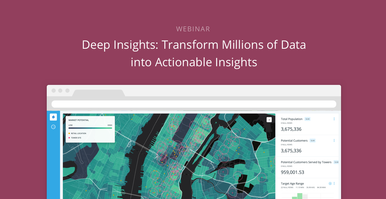
Next week CartoDB will be at Qonnections 2016 as a Silver Sponsor for the first time. Come visit booth #801 to see our demos and learn how CartoDB can enhance your Qlik® business by providing even more value through location intelligence.
-
Have you ever shared a location in WhatsApp? That list of close-by places comes from a geocoding service. When you request a car service, like Didi, the route that the drivers take comes from a routing service. Have you ordered a pizza in Seamless? The maps that show you where the restaurant is located is a basemap service. We call all those services Location Data Services and you are using them all the time.
-
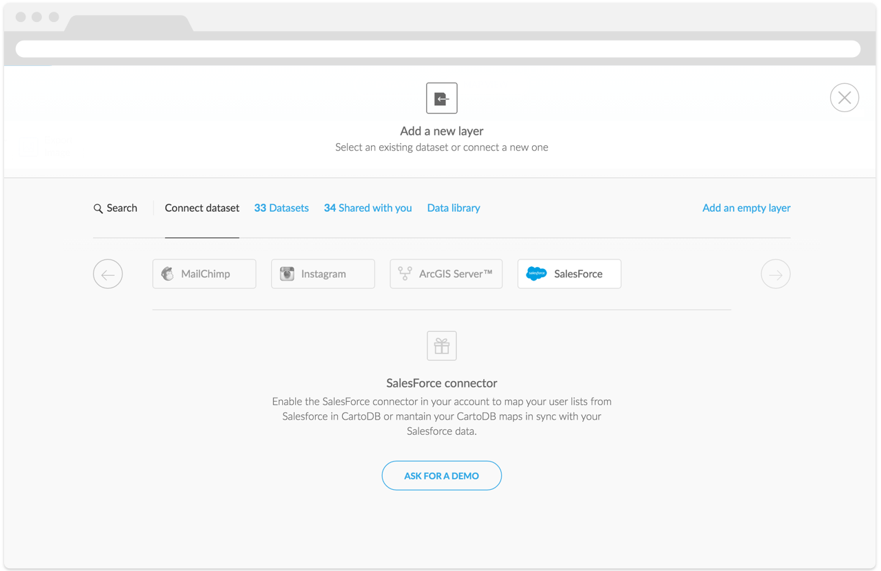
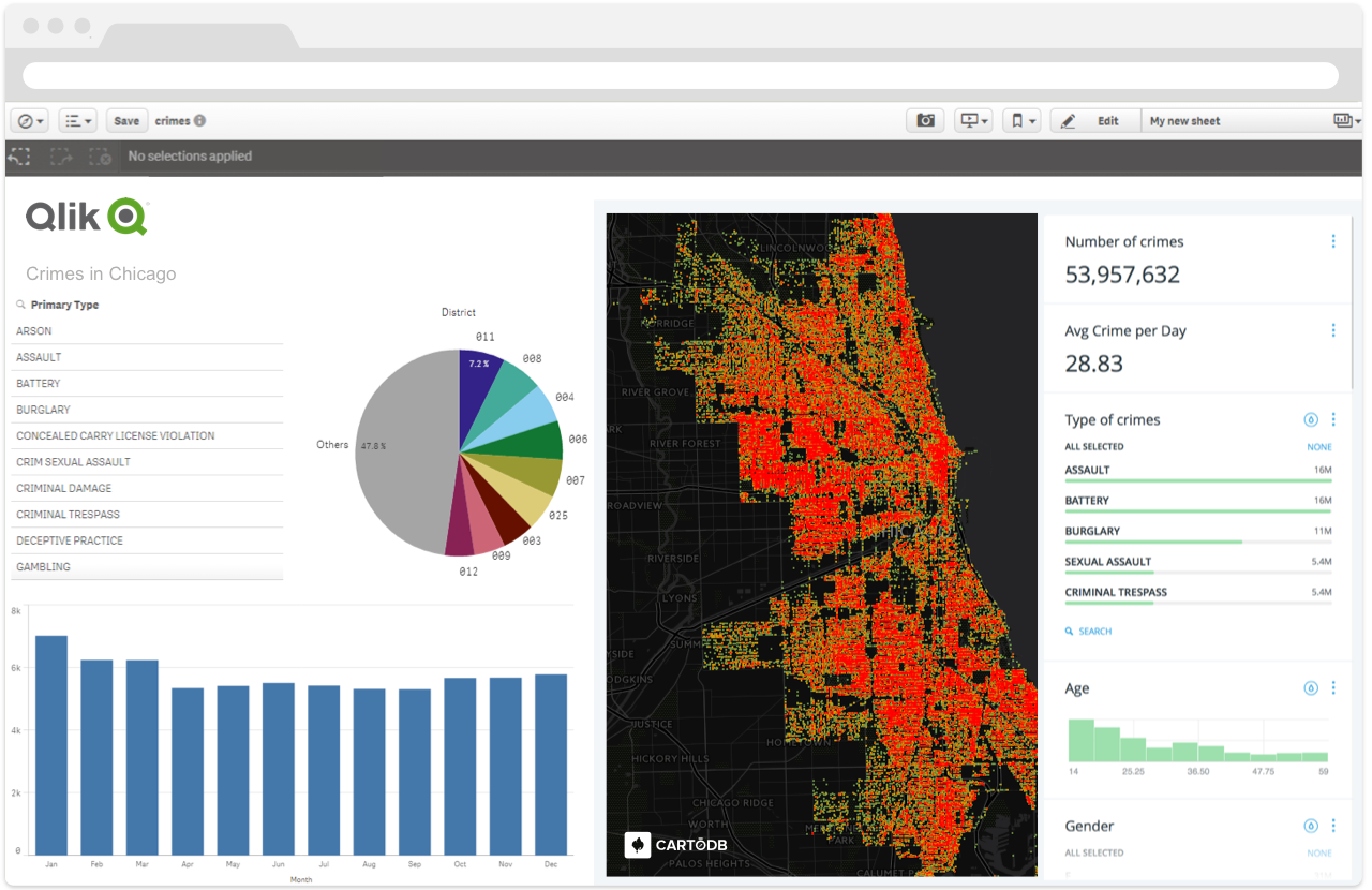
Every Sales Manager and CMO needs to understand how their marketing campaigns influence the bottom-line. Unfortunately, tracking the impact of a campaign is often easier said than done.
Birdseye, a seamless connector between Salesforce and CartoDB, aims to help. Birdseye adds geographic context to your Salesforce data for a deeper understanding of what’s working and what isn’t.
-
One of the things that makes managing geospatial data challenging is the huge variety of scales that geospatial data covers: areas as large as a continent or as small as a man-hole cover.
-
'
The US Environmental Protection Agency (EPA) has an incredible amount of data available to people, and the Risk-Screening Environmental Indicators (RSEI) microdata is a whopper of a dataset. RSEI is an air model which organizes results from environmantal data collected. Specifically, it tallies the quantities of release and transfer of chemicals, and is used to rate the air you breathe. The EPA is re-releasing this data by way of Amazon’s public data portal for anyone to use and visualize.
-
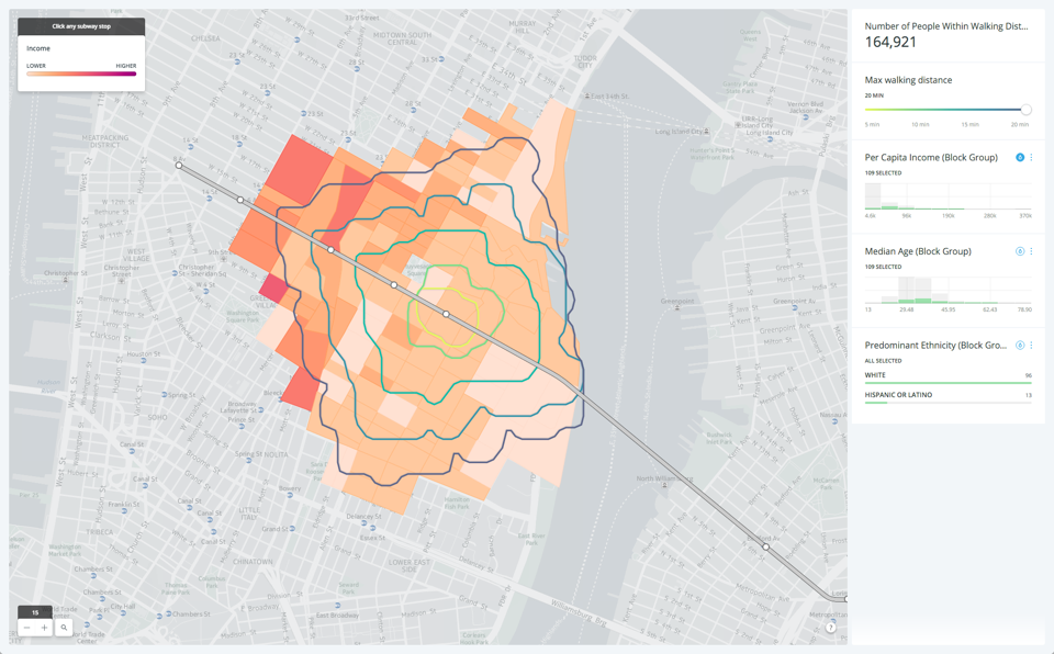
When calculating distances on maps, often we simply compute the ‘as the crow flies’ distance: the length of the straight line that links our origin and destination. For human-centric uses, this is rarely the correct approach as it ignores the fact that we cannot walk on water or pass through solid walls. Instead, we have to navigate among obstacles such as buildings and one-way streets. For many tactical business decisions, we need to use the distance someone would
actually have to walk or drive to get from A to B, which can dramatically change the results.To solve these problems, we introduce isolines. Isolines are a way of measuring how far a person could realistically go from a location in a given time with all the buildings, streets, and other obstacles in their way taken into account. Since they can go in many directions, the lines are the boundary of the surface of all possible end points.
-
You might have seen the blog post we produced a little while ago looking at the
L train closure and the possible impact that might have on L commuters to manhattan. One of the most visually striking elements of that post were the maps where we showed walking routes for people in Brooklyn to their nearest L. We did it a few times, once like above showing all people in Brooklyn, and a second time showing cumulative walking corridors for people that live on the L. You might have wondered how we made those lines, so in this post we will show you how. -
This map shows the distribution of people in the US who have a problem with both their sight and their hearing. It was made using US Census data but if you go looking for sight and vision data in your copy of the US Census files, you aren’t going to find them. How did we make it? In this post we will take you through a quick experiment in using a pinch of public use microdata, a smidgen of machine learning and some inspiration from our friends over at Enigma, to make the US Census reveal to us patterns we’ve never seen before.
-
The news heard by millions of straphangers around New York City last week was Metropolitan Transit Authority’s (MTA) proposed repair to the blighted Canarsie Tunnel, the vital connection used by the L train to connect Manhattan and Brooklyn under the East River. Due to extensive damage caused by flooding from 2012’s Hurricane Sandy, the restoration will have large consequences for L train riders in the near future. How massive and where those consequences can show up, can be understood better using a bit of location intelligence.
-

Organization owners are now able to manage users in their organization with our new Enterprise User Management API!
-
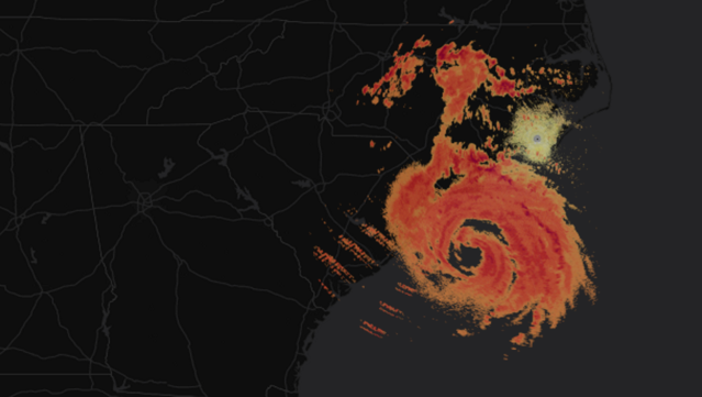
The National Oceanic and Atmospheric Administration (NOAA) has just partnered with Amazon Web Services to make a huge amount of historic and current radar data publicly available. In this tutorial we will show you how to use CartoDB to map this data to explore weather!
-

To an outside observer, serving a population of 150,000 map creators and millions of map viewers might seem like a simple matter, but to us it’s a big complex deal, and we’re always looking for ways to make the CartoDB
platform faster! -
If you’ve ever seen an animated map on the web, or read our technical blogs for the past year, you might be familiar with Torque, CartoDB’s library for animating time-series data on maps. You can already build a range of Torque maps with point data in our Editor GUI: plotting dynamic events, social reactions, traffic patterns, categorical comparisons, and hotspots of activity.
This week, we went further, open sourcing Torque.js, and building documentation for developers to get started customizing Torque code for their projects and contributing to the library at large.
-
FIWARE is a public-private partnership launched by the European Union in 2014 to promote the development of smart cities apps based on open standards and open source code. By providing tools and components in areas such as data management, Internet of Things interoperability, and information security, the initiative seeks to provide simple, standards-based interconnectivity between apps across any vertical.
The FIWARE Development team at Telefónica has recently built a connector for CartoDB. The python script parses data from a FIWARE “Context Broker” (a service which allows for easy publishing of/subscribing to frequently updated data). By leveraging CartoDB’s SQL API, the connector updates rows in a CartoDB table with the latest data from the context broker, keeping the map’s underlying data as fresh as possible.
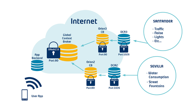
Architecture Diagram of a FiWare "Context Broker" publishing sensor data
-

The migration from GME to CartoDB is incredibly easy. Organizations ready to make the switch can maintain the same great platform and elements that make cartography and data visualization great.
-
Let’s imagine the following scenario…
-
If you’re following our repositories or you are using Odyssey.js you will have discovered that we’ve been using markdown a lot during the last few months.
The Markdown language was created in 2004 by John Gruber, with substantial contributions from Aaron Swartz. Its goal is to allow people “to write using an easy-to-read, easy-to-write plain text format, and optionally convert it to structurally valid XHTML (or HTML).” Because Markdown text files are plain text, you can use almost any text editor to open them.