Category: Academy
-
As we announced last week, today is the first day of Big Data week at CartoDB!
How can we begin to better understand and explain what big data is? Everyday we read in newspapers and social media the words ‘big data’ as it applies to businesses and systems of analysis and data aggregation. While it may seem like a marketing ploy, a critical approach to understanding what exactly big data is can provide new meaning to business intelligence.
-
At CartoDB we do our very best to spread the word on how anyone around the globe can leverage data and visualizations to make better, faster decisions. When great mappers make and discover insights through location intelligence we like to reward them.
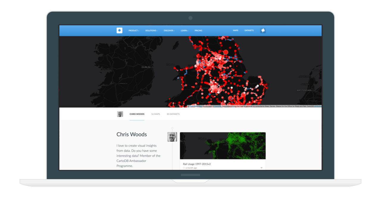
We are proud of our carefully selected and very talented CartoDB Ambassadors. CartoDB Ambassadors are deeply involved in the mapping community and are inspirational educators that use CartoDB technology to empower future mappers. Ambassadors play an essential role to our mission of democratizing location intelligence by producing amazing maps using open data and educating others about the power of CartoDB.
-
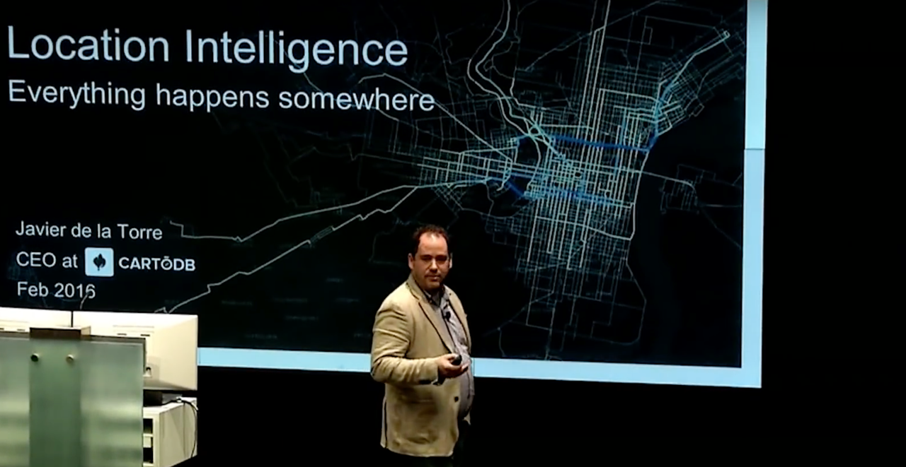
Everything happens somewhere and CartoDB understands that location intelligence is everywhere. Where is the intersection of everything and everywhere? The simple answer is location intelligence, a market that CartoDB leads. We know that the location intelligence market is rapidly changing, with 80% of data having a location component, but only 10% of organizations and companies making use of it. CartoDB wants to change that.
-

This month we announced our acquirement of Nutiteq, a leader in SDK development for all mobile platforms, and our latest innovation, Deep Insights, for unprecedented big data analysis at any scale. In March, we want to continue to help you go further with location intelligence and CartoDB.
-
Onix is a leading provider of IT solutions and services to a broad range of government and corporate customers. Onix partners with location intelligence industry leaders such as CartoDB and offers extensive expertise in the design and implementation of end-to-end comprehensive IT solutions.
-
Rilos, a business-to-business consulting firm that provides solutions and site-location reports to real estate developers, commercial real estate consultants,
and retail data analysts, leverages location intelligence to provide innovative
and impactful insights for their industry! -
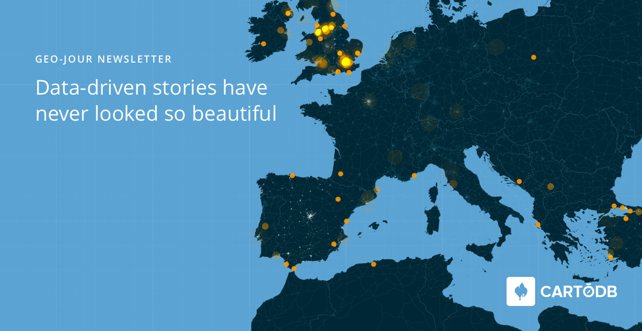
Everyone loves a good story. More than 90 media channels use CartoDB to tell incredible data-driven stories and create industry-leading publications. Because we love our data journalists, we aim to foster a strong community and provide exceptional resources to we can all investigate more deeply and tell
better stories. -
Here at CartoDB we strive to reach new heights of excellence in technology for cities and citizens. Our civic-loving users have always pushed the boundaries of how location intelligence is applied to urban practices, and now we’re giving back in a big way.
-
2016 is off to a great start! Now that we’re one month in, it is time to set the tone for the rest of the year and some of that planning and insight is best visualized. Some industries are already making the most our of data-driven visualizations and their business intelligence.
-
“Find me the nearest…” is a common way to start a geographical query, and we’ve talked about how to write such queries for single points, but it can be tricky to carry out in bulk.
CartoDB supports high performance “nearest neighbor” queries, but getting them to run in bulk on a whole table can be tricky, so let’s look at the SQL we need to make it happen.
-
The NYPD recently made waves with an open data release, sharing fairly detailed crime data about the “seven major felonies” for the first 3 quarters of 2015. The dataset has a row for every incident, including location (as lat/lon), date/time, etc. However, as with many crime datasets, the point locations have been adjusted to mid-block or nearest intersection so that you can’t determine exactly where the reported crime occurred. As you might expect, there are many locations in NYC where multiple crimes occurred on the same block/intersection, so we end up with many rows that have the exact same point coordinates. This is a mapper’s conundrum, as point markers will simply overlap each other, only allowing you to see the one point when there are many beneath it.
-
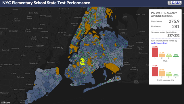
Many universities around the world use CartoDB, for research and in the classroom, to create interactive tools for educators and departments. Types of visualizations vary from historical occurrences, natural events, predictions, economic trends, population performance, and disease evolution.
View how test scores are visualized per school district in polygons to show elementary school student performance in New York City.
-
Join CartoDB scientists Andy Eschbacher and Stuart Lynn, fellow geospatial data wranglers, and web cartographers at our Intermediate SQL workshop on Tuesday, January 12th!
-
Have you ever had trouble making your map look legible when it has a large numer of overlapping elements? Have you ever wanted to control subtle effects when one geometry overlays multiple geometries of different colors? You can solve all of these problems and more by using the composite operations baked into the CartoCSS map design language!
-
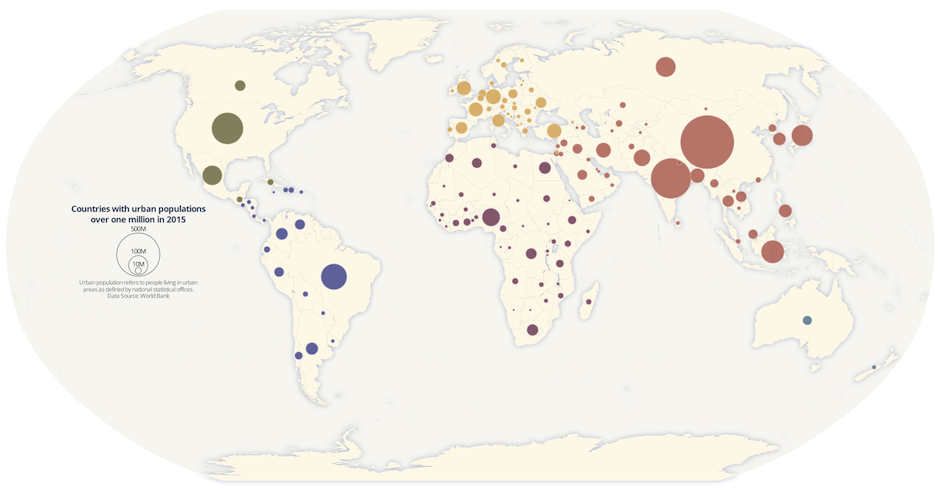
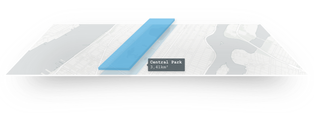
Proportional symbol maps are used to represent point data that are attached to a specific geographic location (like a city) or data aggregated to a point from an area (like a state). The area of each symbol on the map (usually a circle) is scaled according to its value at a given geographic location using either absolute scaling or range-grading. The result is a map where larger symbols indicate higher values and smaller ones, lower values. This type of map is flexible in that you can represent raw data values (total population) or data that are normalized (percentage of population).
In this blog, I’ll walk through the basic principles of proportional symbols and some best practices when designing them. Then, I’ll cover the steps to make a map of 2015 urban population by country using the absolute scaling method.
-
The ideal intelligent city model is one where technology and data serves the goal of improved standards of living, sustainable use of resources and pollution reduction. And location data has a critical role to play in getting there.
For officials and citizens looking at planning and metrics for water, traffic management, lighting and construction, integration of information from city departments is necessary. Data must be presented in accessible formats for efficient management and response times.
-
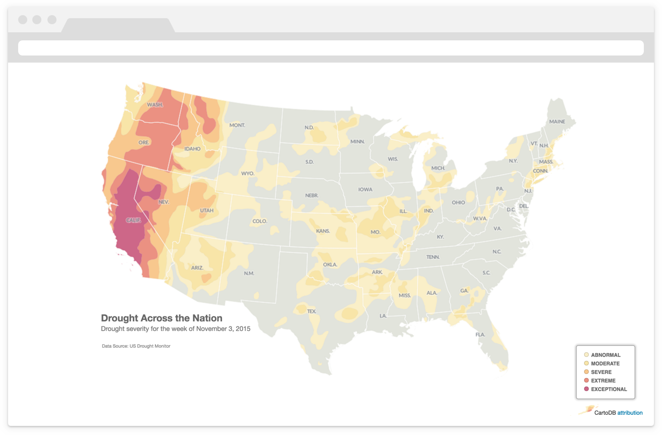
The most common maps built with CartoDB highlight a specific topic or theme of information. Cartographers refer to these as thematic maps. Typically, thematic maps have two components: a basemap and a thematic overlay.
The logical ordering (or visual hierarchy) of elements on thematic maps is especially important. The thematic layer should be highest in the visual hierarchy designed with bold colors to stand out against the more subtly
designed basemap.Building on these ideas, and this previous discussion on map projections in CartoDB, this blog walks through the steps to make a thematic map of current drought conditions in the United States using data from the United States Drought Monitor.
-
Election season is fast approaching! How can news outlets and media agencies set themselves apart from the rest of the articles on the campaign trail? Data-driven visualizations that’s how!
-

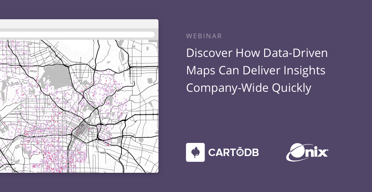
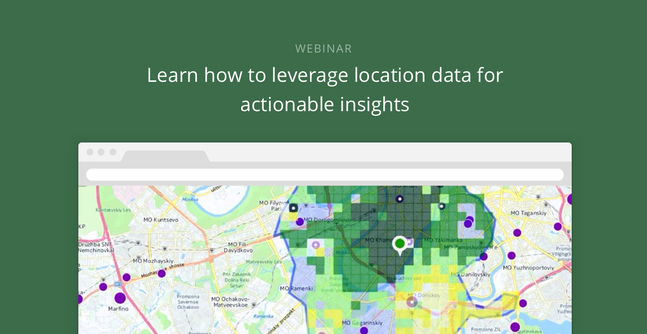
CartoDB is excited to announce a series of webinars designed to meet your industry specific needs.
From now to March 2016, we will host a once a month series of 45-minute webinars that are focused on various professional sectors. During these webinars, we will share with you all the relative visualizations related to the webinar topic, as well as give you tips about how to get the most out of CartoDB for your sector. We’ll also share with you resources that are useful in creating stunning data-driven visualizations.
-
Every year, all around the world, people celebrate all things geospatial in mid-November. It is a great opportunity to pick up new skills, learn new platforms, and -most importantly- make and share new maps.
-
Most maps that we see on the web use the Web Mercator projection. Web Mercator gained its popularity because it provides an efficient way for a two-dimensional flat map to be chopped up into seamless 256x256 pixel map tiles that load quickly into the rectangular shape of your browser.
If you asked a cartographer which map projection you should choose for your map, most of the time the answer would not be Web Mercator. What projection you choose depends on your map’s extent, the type of data you are mapping, and as with all maps, the story you want to tell.
Well, get excited because with a few lines of SQL in CartoDB, you can free your maps from Web Mercator!
-
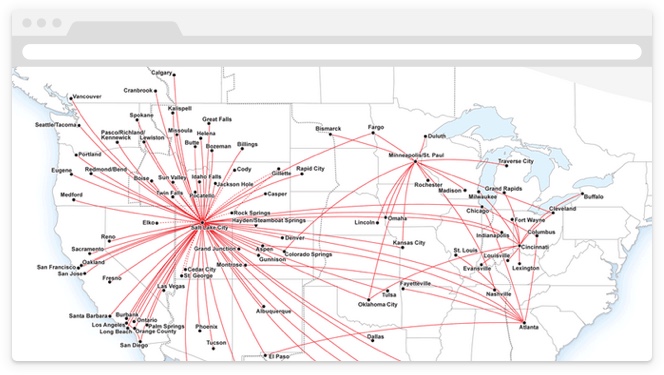
As a child, nothing was more exciting to me than a chance to ride on an airplane. And after enjoying playing with the seatbelt buckle and feeling the crazy push of take-off acceleration, I would usually settle in and page to the back of the in-flight magazine where the airline route maps were: where were we going today, and where could we go tomorrow?
-
Ever wonder which kind of map to make? Lesson 1 of our new Intermediate Map Design Map Academy course can help you decide!
-
When I saw this tweet from Jorge Arévalo I couldn’t resist.
How to Track NBA Player Movements in Python http://t.co/sZQG48oGfQ
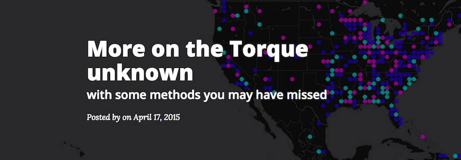
— Jorge Arévalo (@jorgeas80) August 28, 2015The blog post linked in Jorge’s tweet nicely explains how to process NBA statistics data in order to analyse it and generate some charts of different metrics. When I was reading the blog post, I immediately saw coordinates and time and thought that it would be cool to try visualizing it with Torque, our own temporal mapping library.
-
With summer starting to wrap up in the Northern Hemisphere, so are trips to the beach, the mountains, or anywhere in between. What better time than now to highlight all the memories made with your GPS mobile device?
-
Sync Tables are my favorites; having almost real-time maps without having to code a single line is something that I find amazing, even if this element has been a CartoDB staple for a long time now. This is my personal tribute to the feature, and a list of ideas that I hope you find inspiring.
-

Apps with maps, on phones and on the web, are frequently built around “nearest neighbor” queries, sifting through a database to find the records that are contextually appropriate given an input location.
- Find me all the records that fit in the map!
- Find me all the records within 1km of the user location!
- Find me the 10 records nearest to the user!
For “records”, replace with “restaurants” or “gas stations” or “future close friends” depending on the application you are building.
-
Recently, I was working with an utility company that wanted to use CartoDB as a web mapping platform replacement for the way they currently generate maps of their physical infrastructure: AutoCAD.
-
CartoDB is built on top of PostGIS, the powerful add-on that turns PostgreSQL into a spatial database. Many popular Geoprocessing functions in GIS software can be done with PostGIS queries, and this blog series will provide a one-for-one replication of the functions in QGIS’ Vector>Geoprocessing Tools menu.
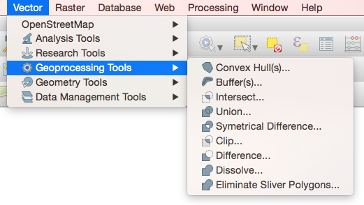
In QGIS, the Vector menu has all sorts of goodies, but we’ll focus on the Geoprocessing Tools submenu, which has Convex Hulls, Buffers, Intersects, Unions, Dissolves, and more. If you’re making maps, these are important tools for the data-munging process, and with a little SQL and PostGIS you can do them right here in CartoDB! We’ll start with two: Convex Hull and Buffer.
-
In the second addition of our series on clever mapping with GDELT data (see this post from last week), we wanted to take on some more advanced mapping techniques. Again, we welcome Kalev H. Leetaru of the GDELT Project to explain how using geospatial information about journalism can build a better understanding of media in our world! Read on for more!
-
What would it look like to literally map the world’s news as it happens? What if you could reach across a growing fraction of the world’s news media every day, in real time, in 65 languages, and put a dot on a map for every mention in every article, in every language of any location on earth, along with the people, organizations, topics, and emotions associated with each place? That’s the vision that drives the GDELT Project.
In the wake of our GeoJourNews conference, celebrating journalists, cartographers and coders, we have an exciting partnership to announce with GDELT, one that we hope will only further support our community! We welcome Kalev H. Leetaru, a Senior Fellow at the George Washington University Center for Cyber & Homeland Security in Washington DC, to author a guest post demoing how CartoDB can be used to map the world’s news in real time!
-
CartoDB has an excellent and easy-to-use synced tables feature, that reads data from a public URL on a regular schedule and keeps an associated CartoDB table up-to-date. However, synced tables require the data to be publicly available so CartoDB can read it, and that the destination table get over-written at each update.
-
This past Saturday, an epic earthquake devastated Nepal, resulting in a profound death toll and an impressive response from the humanitarian and crisis-mapping community.
We’ll be updating this post with continuous maps focused on the Nepal region, the aftermath of the tremors, and the humanitarian response flooding media reports and Twitter testimonies globally. Read on for a summary of some informative maps and some how-tos on embedding maps in your next report.
Updates as of 6/27/15 22:50 EST.
-
“How many layers does CartoDB support?” It’s a question we hear often. The word “layer” has been a part of the GIS nomenclature since the times of John Snow, and the geospatial community is used to thinking in terms of layers. Many of the prevailing desktop GIS software packages support this mode of thinking with “layer browsers” that have checkboxes for roads, parks, tax lots, pipes - in short, each and every type of dataset in the user’s project.
Aye, but there’s the word: dataset! A “layer” is often really just a dataset. Nothing more, nothing less. In a relational database environment, like CartoDB, individual datasets are stored as tables. And since PostgreSQL (and therefore CartoDB) can support thousands and thousands of tables of data, the answer to “how many layers does CartoDB support?” is pretty much as many as you would like! If you need to, this makes creating a “geoportal” site to all your organization’s geospatial datasets no problem at all.
-
World Water Day was celebrated this past Sunday bringing attention to issues around water and sustainable development. Given current water use, the UN predicts the world will face a 40% shortfall in water by 2030. Recent news on California’s on-going drought, and the environmental risk posed by hundreds of dams in the US highlight the importance of water in our lives.
-
Data.gov has been publishing United States Federal Government data since 2009. Their mission is to increase public access to over 125,000 datasets they have already published and many others they are still collecting and indexing. In the years since its launch, the platform has stimulated creativity through civic hackers, technology companies, educators, and many others.
-
In 1905, the New York Times declared New York City, “the noisiest city on Earth.” Little has seemingly changed with hundreds of thousands of noise complaints logged with the city’s 311 complaint hotline every year since 2010. As a public data excerise, I created a choropleth map of 311 noise complaint data from 2014 normalized against the latest population figures from the city.
Mapping New Yorker noise complaints can only give us a spatial dimension to individual perceptions of noise. Our sense of what constitutes noise is highly personal, determined by factors such as our upbringing, community and society. Until the city attempts to measure the street noise by decibels, the only available data to work from is the city’s 311 complaint line. Here’s what I learned, and how to make your very own Noisy New York City map.
-
Making maps can be a challenge. Whether you’re just getting started with the CartoDB Editor or you’re a seasoned geo-spatial developer using the CartoDB Platform, The tools that CartoDB offers allows for incredible versatility in how data is visualized, analyzed and made interactive. Just take a look at some of the awesome use-cases in our gallery!
-
World Radio Day was celebrated around the world last week in acknowledgment of the impact and importance of radio. We’re late to the party, but couldn’t think of a better way to celebrate the importance of radio than with a torque heatmap of Low Power FM radio stations going on the air - tracking the expansion of LPFM service from 2000 - March 2011 with data provided by the FCC.
In what ways is Low Power FM radio, otherwise known as independent or community radio, so important?
-
Today we are excited to bring you a guest post from our friends at KimonoLabs. If you aren’t familiar with Kimono, they bring a set of tools that enable you to create APIs from data and information scattered throughout the Web. We highly recommend checking them out. Below, they will share with you the steps for turning a website into an API and then how to use CartoDB to map that API in some really interesting ways. This was posted originally over on Kimono’s blog here, thanks for the permission to repost!
-
Fall semester is coming to a close and with that thousands of incredible educators get to wrap up their courses and start planning for the next ones. We are really proud that CartoDB has been a part of many of those courses and will be a bigger part of many more next semester. That is why we thought it was time to start digging into the challenges of teaching with maps in the classroom.
-
Geospatial data lovers know that proximity has its perks- especially in a major city like New York. We recently spent a few minutes browsing through the work of New York Public Library’s Map Division and discovering all of the awesome tools they’re creating- one of which we are about to share with you. World, meet (or re-meet for those of you who already know) MapWarper: The NYPL’s open-access tool for rectifying historical maps from its collections and making them available to the public.
-
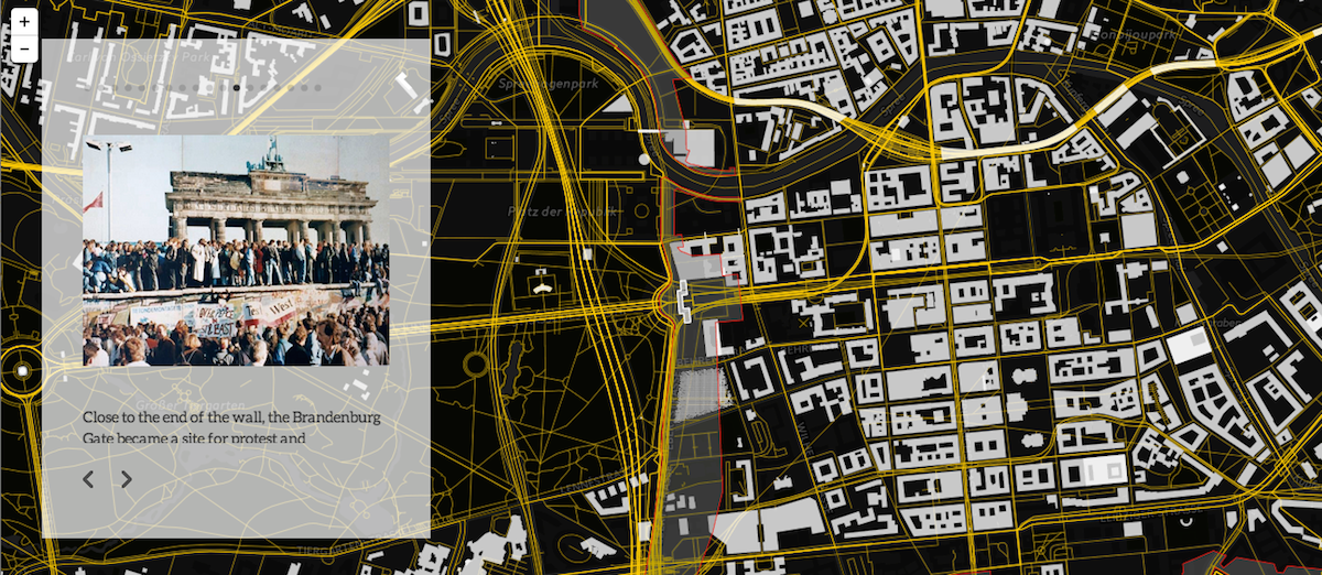
November 9th was the 25th anniversary of the Berlin Wall coming down, and to commemorate the anniversary of this monumental event, we have created a beautiful interactive map story using our easy to use story telling tool Odyssey.js and CartoDB!
-

The dynamic of today’s media and communication is described as “soundbite culture,” in reference to our increased consumption of information and impatience with reading long text. Coupled with the proliferation of digital screens, data visualization now dominates daily life. But we have hardly been taught how to communicate in visual ways.
-

Today, we’re going to look into publicly available data from Yelp, specifically, from Las Vegas. The data includes reviews on businesses, mostly restaurants, all around the Greater Las Vegas area. We thought this data would be interesting to build our latest installment of Mapping the Invisible. Using this data has some restrictions from Yelp, so we suggest you look over their use agreement before going too deep. But we do think the methods we show you here could inspire you to extract new understanding from your own data.
-

CartoDB is more than just a useful tool for visualizing spreadsheets. When you use CartoDB you have the ability to tap into powerful data manipulation and GIS tools as well. To showcase these capabilities, we are creating a short series, Mapping the invisible. As the title may suggest, we’ll be exploring different datasets, doing analysis and visualizations to tell stories that are hidden in that data, so you can learn and get inspired to work with CartoDB.
-

On the 24th of July, our senior scientist Andrew Hill hosted a webinar to teach how you can use CartoDB to develop geospatial applications.
-

The CartoDB Platform
Many people come to CartoDB and see the Editor, our simple and easy to use tool that runs in your browser and helps you publish beautiful maps. Fewer of them discover the full range of capabilities CartoDB offers when you dig into SQL or the Platform capabilities. The CartoDB Platform is a collection of APIs that allow you to perform data manipulation, map creation, and data analysis all without ever touching the Editor.
-
There is no doubt that we live on an ever-changing planet. Earth Observation provides a great tool to monitor and track these changes, ranging from climate transformations to others caused by human impact. Among the different organizations monitoring the earth, NASA is one of the most prominent. With their Earth Observation satellites they take daily snapshots of Earth and make them freely available on the Internet. Together with ESA’s Image of the Week, their Twitter account is one of our favorites.
-
As you may’ve heard, Facebook has bought yet another company, our favorite Moves. Moves track your daily activity, including your location. And when it comes to location, what better app helps you to visualize and analyze than CartoDB? Learn how much location info Moves has about you with this simple guide: just upload your Moves data to CartoDB and -no step 2- visualize it!
-
Mapping historic and temporal data can be challenging. A lot of times you need to think about clever ways to aggregate or filter that data so you can highlight and tell a story without losing too much of the overall picture. But with our recent release of Torque maps, we expanded your options for mapping temporal data, giving your viewers the ability to play, pause, and backup animated data in order to explore how the data changes over time. We just pushed an awesome little enhancement to Torque visualizations: cumulative visualizations.
-
Excel spreadsheets have to be one of the most used data storage formats used in the office today. Whether you need to quickly look at your data in rows and columns, or if you need formulas and pivot tables, or if you just need to make quick fixes in your data, Excel is a useful and easy to use tool. Now, if you add CartoDB to the mix and mapping Excel files just became easy and beautiful.
-
We finished the first class in our mapping academy series last night. We think it was s tremendous success and couldn’t be happier about the turnout and reception. Thank you to everyone who joined us! If you missed the event, you can find all the details about it on the Academy homepage
-
Today we have a guest blogpost up on the OKCon blog about telling stories with open data. The post talks a bit about our recent work with the PLUTO data. We wrote the post to both talk about our interest in open data and to let people know about our workshop at this year’s OKCon event in mid-September.
-
We often get questions and support tickets from people that want to upload files to CartoDB without having to do it through the browser. For these people, we needed a file API, where they could point a script or application to upload a file and have it turned into a table. Today, we wanted to show you our Import API and a few helpful little tools that you can use to get started.
-
A handful of developers using CartoDB have begun to build tools that incorporate CartoDB data and the Leaflet.draw plugin. It is a pretty neat combination of tools, that allow anyone to create polygon editing interfaces on top of their datasets. It also lets you build custom data management interfaces on top of a powerful geospatial database. We used it for a fun demo at the recent FOSS4G-NA meeting and it gave us the chance to see how it could work. The library is pretty straightforward, though it does take a basic grasp of GeoJSON, JavaScript, and the gang of usual suspects.
-
As many of you know, we are very involved in the GeoNYC meetings, helping to organize, contribute to, and sponsor for over a year now. It has been exciting to see the active geo community grow so quickly over that time. Tonight will be one of the biggest GeoNYC meetings to date, with a sellout crowd of 130 mappers joining us at Google.
-
Today we hear a fun guestpost from Steve Gifford of Mousebird Consulting. Steve has done some very interesting work with maps using iOS, 3D globes, and CartoDB. Today, he tells us a bit about that work.
-
We are always working to improve CartoDB, so we’re thrilled when we find great partners to help us take the platform even further faster for our users. Today we’re excited to share a guest post from mobile mapping software leader Nutiteq, our newest partner. Welcome to greater mapping mobile interactivity.
-
While many CartoDB users arrive to the service with data on hand others look to use CartoDB to host and map data from ongoing collection. For those users, we offer a number of useful client libraries and tutorials for using our APIs. For businesses, scientists, and students that still want a little easier way to collect data, we thought we would put together this tutorial covering how to collect data with Google Forms and have it inserted directly into a CartoDB table.
-
We have been discussing a lot lately how we can summarize CartoDB in a short and sweet sentence. A lot of adjectives have been tested. One of the options we have liked the most is, CartoDB allows you to render your data on a map. As simple as the phrase sounds, it packs a lot of meaning. Let us explain”
-
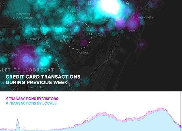
We often find ourselves exploring what interesting things can be found in data that changes through time. In recent blog posts about the Mobile World Congress (MWC), we have published a couple interesting experiments with temporal data. In the first, we showed how CartoDB could be used to map traffic in Barcelona.
-
Maps are a wonderful way to tell stories, and with today’s release of The Hobbit: An Unexpected Journey, we felt a visualization of the film’s locations in New Zealand would be suiting, and while Bilbo went “There and Back Again” in an adventure that film revelers the world throughout will undoubtedly flock to this weekend. Peter Jackson and the crew of the Hobbit Movie did much of the same, spending a grueling 266 days filming in the studio, and then travelling the country in two teams to shoot those locations that make up Middle Earth in the film.
-
The Stones passed the half-centuty mark as a band this year. An incredible achievement for an incredible band. They also happen to be one of the most prolific touring bands in the world with more than 1,300 concerts all over the world, and over the last 50 years they have have traveled almost 1,000,000 Km (960,000 km actually).
-
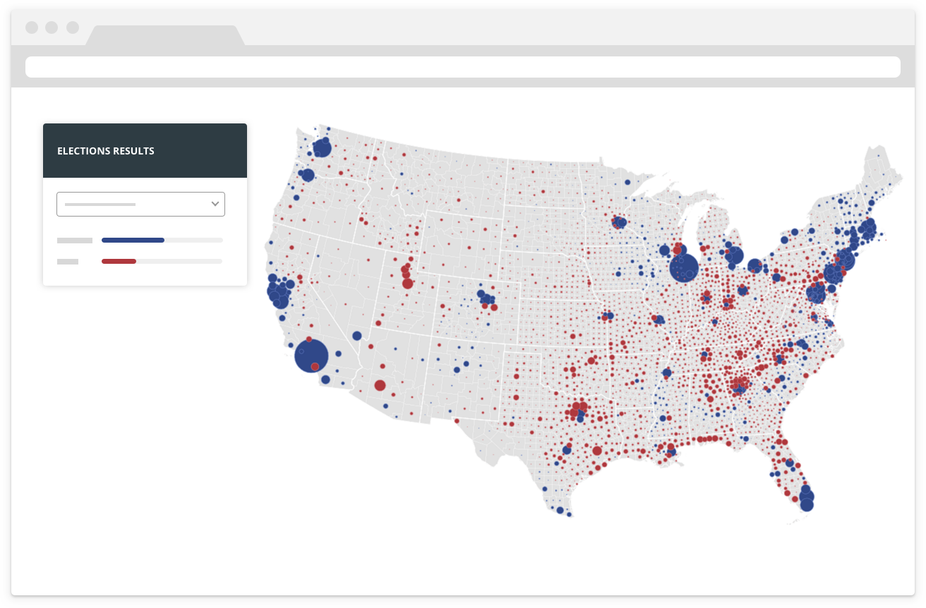
With US Presidential Election just around the corner, we want to show you how to use CartoDB to power dynamic, fully scalable, cross-device maps that update instantly, with no need to refresh the browser.
-
Eight million people followed yesterday the YouTube live stream from the Red Bull Stratos Challenge. According to the video service, it was the largest-ever simultaneous viewing for a web audience.
-
The combination of styling with SQL on CartoDB gives a surprising range of freedom to create data visualizations. I find myself often thinking about creative solutions to mapping data in interesting ways.
-
At CartoDB, it is our goal to give our users the tools necessary to create compelling visualizations with their data. We are continuously looking for new innovative technologies that will enable data-driven storytelling.
-
Code for America is a non-profit organization developing open source projects for city governments. Through several initiatives, it’s building a network of cities, citizens, community groups, and startups “committed to reimagining government for the 21st century”.
-
It is not a secret that one of the reasons we created CartoDB was the lack of alternatives for geospatial data visualizations. For several years we developed our own custom solutions to visualize large amounts of dynamic data, or to develop location aware applications. Many geospatial applications run on top of the fantastic PostgreSQL/PostGIS database, but most of the software built to use them on the web end up being slow or don’t access the full potential of PostGIS. Also, a lot of them are proprietary and include very tough terms of service. We wanted to create a software that would explode the possibilities of PostGIS while keeping it Open Source, scalable, customizable and leaving you the owner of your own data.
-
Last Wherecamp in SF was very fruitful. We met Steve Gifford, an experienced software developer and the creator of WhirlyGlobe, an Open Source 3D globe engine for iPad. WhirlyGlobe take cares of managing the globe with the performance of OpenGL, and allows you to overlay data on top of it.
-
Last week CartoDB was presented at New York Tech Meetup. The audience in the auditorium was over 800 and more over the broadcasting. There was great interest from the NY Tech community.
-
Yesterday it was announce that SimpleGeo, now bought by Urban Airship, will stop their operations. They have published a document explaining how to migrate to some alternative services, and they recommend PostGIS as an Open Source solution for their storage option.
-
We, web developers, love JSON, so having a way to use GeoJSON on PostGIS it is kind of a no brainer. Well, thanks to Kashif Rasul, OpenGeo and a bit of financial help from Vizzuality, now we have it available!