Category: New features
-
From the very beginning, CartoDB has focused and researched how to make visual exploration of location data easier and more compelling. For most of that research, we rely on standard languages that are easy to use and learn, such as SQL and CartoCSS.
Now, we are taking CartoCSS a step further and adding new capabilities centered on data-driven styling. We’ve done this before with torque.js.
-
When visualizing, on a map, tens of thousands or millions of points in a dataset, data points may be spread all around the world, or be confined to a single country, region, city, or even some smaller area. In any case, there will be a zoom level in which the whole dataset is represented in a single 256x256 pixel tile. The “great mother of all tiles”, tile 0/0/0, will inevitably have to show the whole collection of points.
-
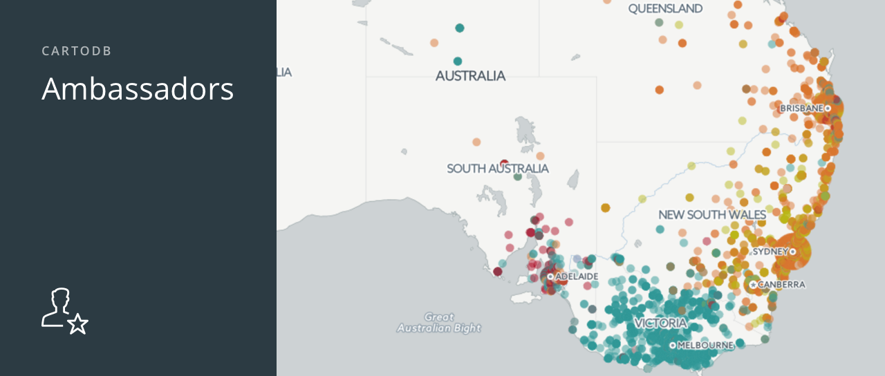
Last year the Ambassadors Program started as an experiment, with select CartoDB users receiving slight upgrades to their accounts. Since then, we have been watching our program grow and find ourselves constantly amazed at the level of talent and passion of our Ambassadors. We like to think that the upgraded Ambassadors accounts (more storage, more layers, sync tables, etc.) have played a part in this. ;)
Because we love what we’ve seen thus far, we are now expanding the Ambassadors Program!
-
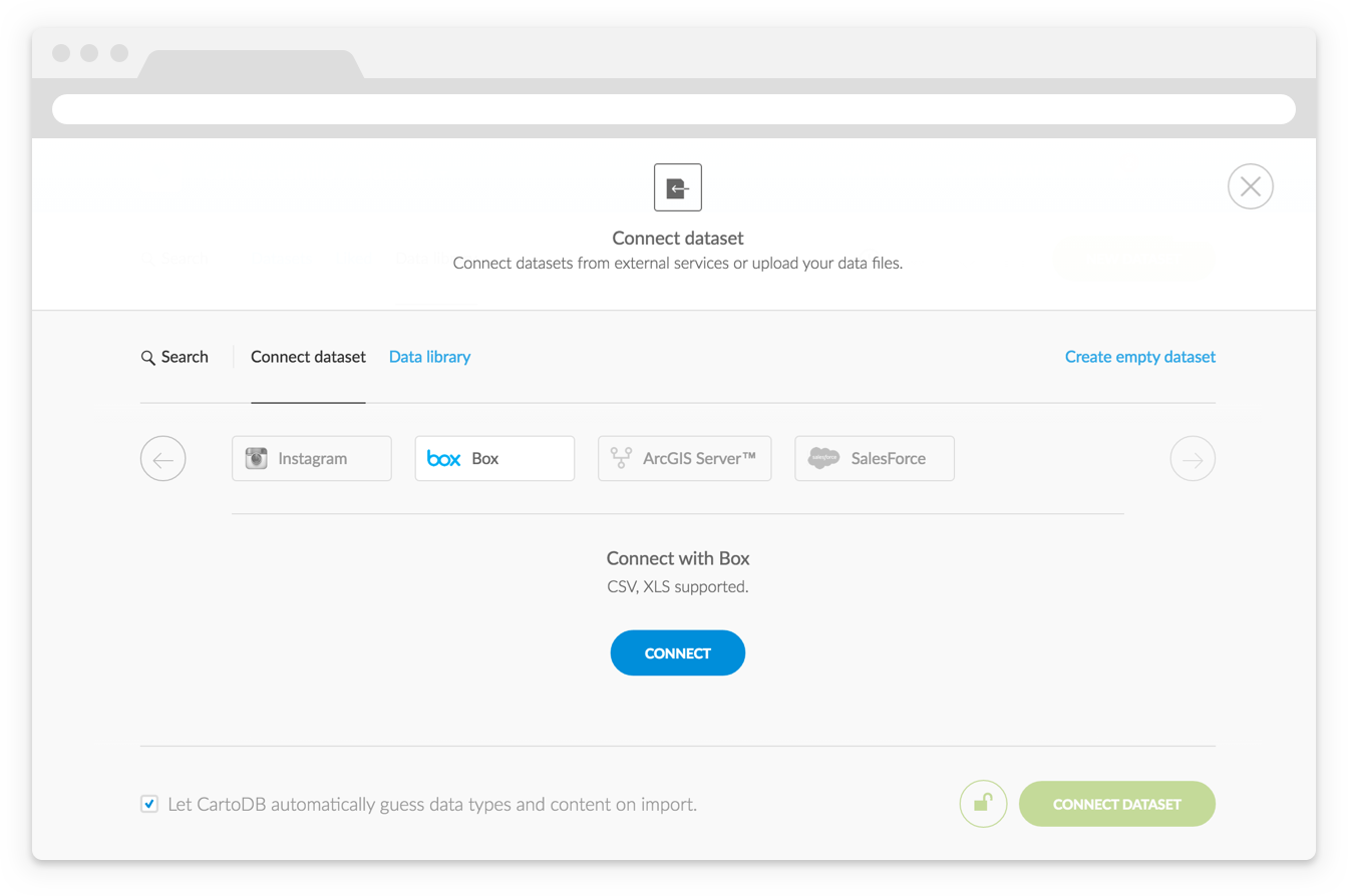
Every Sales Manager and CMO needs to understand how their marketing campaigns influence the bottom-line. Unfortunately, tracking the impact of a campaign is often easier said than done.
Birdseye, a seamless connector between Salesforce and CartoDB, aims to help. Birdseye adds geographic context to your Salesforce data for a deeper understanding of what’s working and what isn’t.
-
'
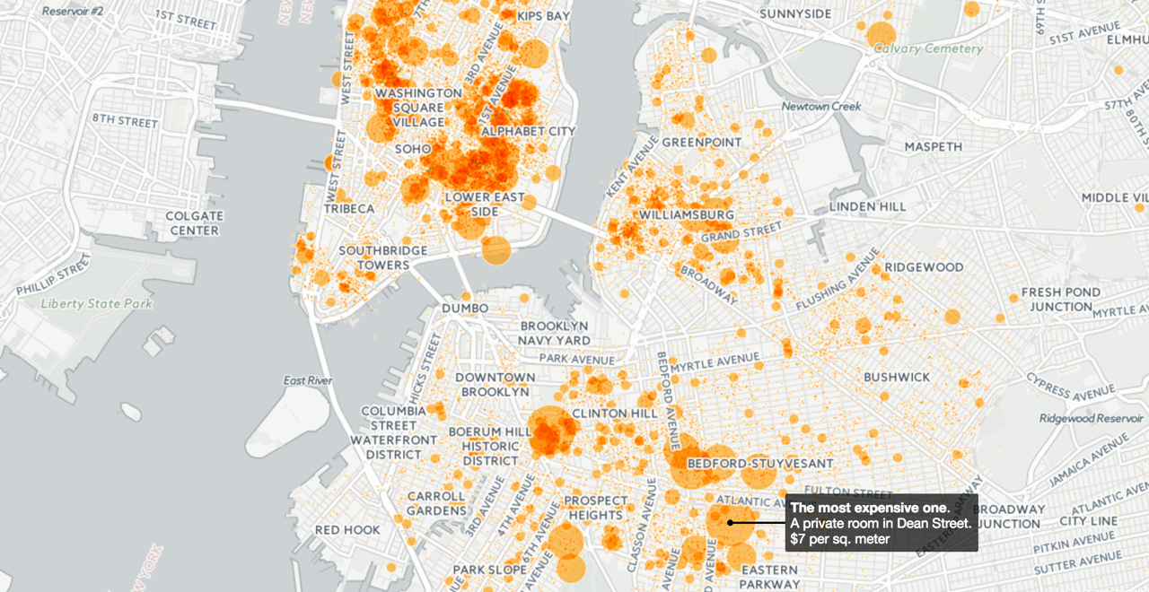
The US Environmental Protection Agency (EPA) has an incredible amount of data available to people, and the Risk-Screening Environmental Indicators (RSEI) microdata is a whopper of a dataset. RSEI is an air model which organizes results from environmantal data collected. Specifically, it tallies the quantities of release and transfer of chemicals, and is used to rate the air you breathe. The EPA is re-releasing this data by way of Amazon’s public data portal for anyone to use and visualize.
-
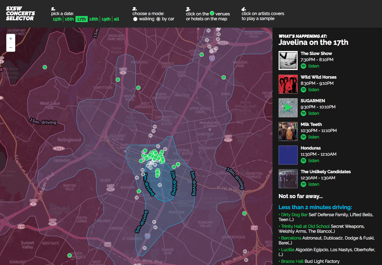
Planning where to strategically go next can be a daunting task. There are numerous factors to consider, like time. At major festivals, like SXSW, planning how long it takes to move from place to place doesn’t have to be so intimidating anymore. Time and Distance Isolines (also called isochrones), a new feature coming to the CartoDB platform, allows you to measure time directly through SQL statements. Time isolines provides insight and analysis on how long it takes pedestrians to move from one hotspot to the next, making tactical business planning a cinch.
-
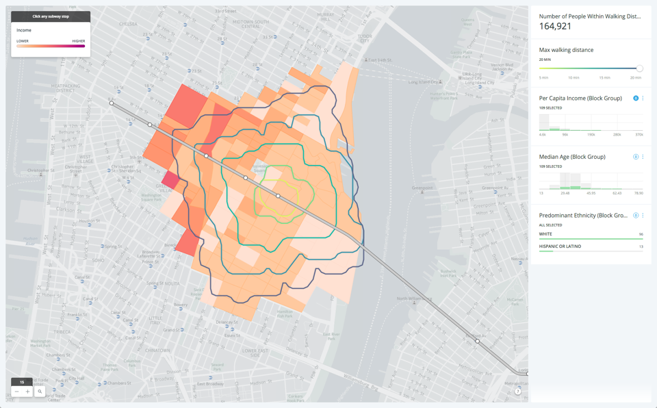
When calculating distances on maps, often we simply compute the ‘as the crow flies’ distance: the length of the straight line that links our origin and destination. For human-centric uses, this is rarely the correct approach as it ignores the fact that we cannot walk on water or pass through solid walls. Instead, we have to navigate among obstacles such as buildings and one-way streets. For many tactical business decisions, we need to use the distance someone would
actually have to walk or drive to get from A to B, which can dramatically change the results.To solve these problems, we introduce isolines. Isolines are a way of measuring how far a person could realistically go from a location in a given time with all the buildings, streets, and other obstacles in their way taken into account. Since they can go in many directions, the lines are the boundary of the surface of all possible end points.
-
Using CartoDB.js and the CartoDB Platform, you get the best of both worlds: powerful GIS technologies with no setup required combined with the complete freedom provided by the HTML5 stack.
It’s so addictive in fact, that at some point you’ll be building a ton of interactive maps without even realizing it. And inevitably, you will end up doing a few repetitive tasks every time: creating boilerplate files, importing JavaScript libraries, setting up a local web server, etc…
-
Welcome, CartoDB community, to Deep Insights—CartoDB’s solution to make the invisible visible, and allow you to discover unseen correlations and patterns at an unprecedented scale.
-
Did this past weekend’s East Coast blizzard leave you with the feeling of wishing you could pinpoint where you built that wicked igloo during Snowstorm Jonas?
-

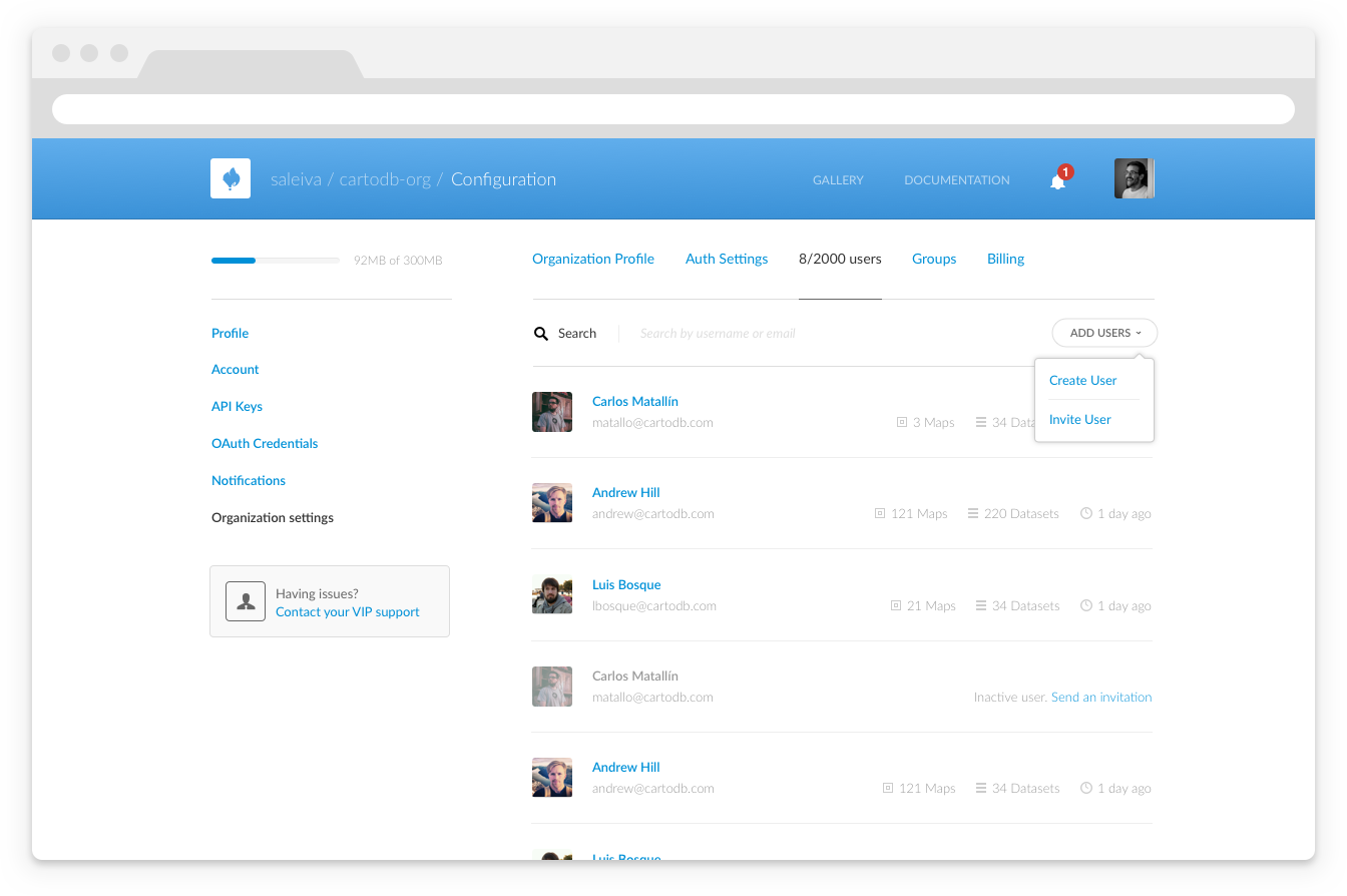
Organization owners are now able to manage users in their organization with our new Enterprise User Management API!
-
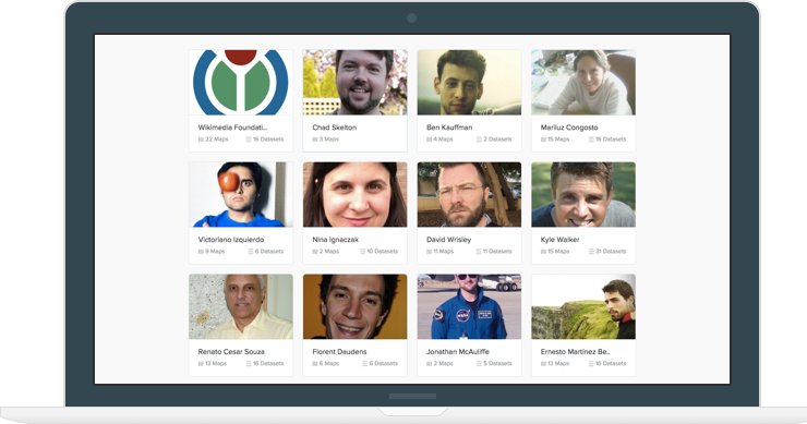
We are happy to announce our new CartoDB Ambassadors page — we want to reward our our influential mappers for all their great work in CartoDB! As an Ambagitssador mapper, you will be able to display a portfolio of maps on our site, with increased visibility in the mapping community. We will blog about your projects, and share them throughout the CartoDB community.
-
Sharing insights with your peers and colleagues just got easier. CartoDB now permits organization administrators to set up user groups to share data-driven visualizations and datasets with our permissions management system.
-
CartoDB’s strength is its agility working alongside other excellent tools in a mapping workflow. QGIS (Quantum GIS) is one of those tools, and its position as a no-cost open-source GIS software leader makes it an accessible, and affordable choice in exploring data. Now, the two can work together much
more seamlessly. -
At CartoDB we listen to what our users need and want. We are constantly brainstorming and coming up with new ideas, but it is always the very best in user experience that we hope to deliver. This month we’ve launched two brand new sections on our website: Explore and /me!
Visit Explore to see the top trendy maps of the day. The new explore section allows users to browse the most popular public CartoDB data-driven visualizations. Now you can see the top 10 maps from all CartoDB users based on three criteria: likes, views, and date. You can also filter your list by “maps”, “datasets”, or “maps and datasets”! Additionally, you can order visualizations by most ‘likes’ and views.
-

Here at CartoDB we are always looking for new ways to enable our educational communities. From our commitment to Education and Research in the Classroom to our popular Educator’s Nights and workshops at universities, we’re working hard to spark new ideas in geospatial visualization and analysis across all professional fields.
-
Qlik Sense users no longer have to rely on just the classic way of visualizing important decisions. Now in addition to graphs, pie charts, and other visual analytics, Qlik Sense users can use CartoDB’s slick Torque animated maps as well as additional visualization renderings. CartoDB for Qlik enables the creation of data-driven maps to visualize location data within the Qlik Sense Dashboard, which is personalized to maximize analytics to get the most impact and insights from your data.
-
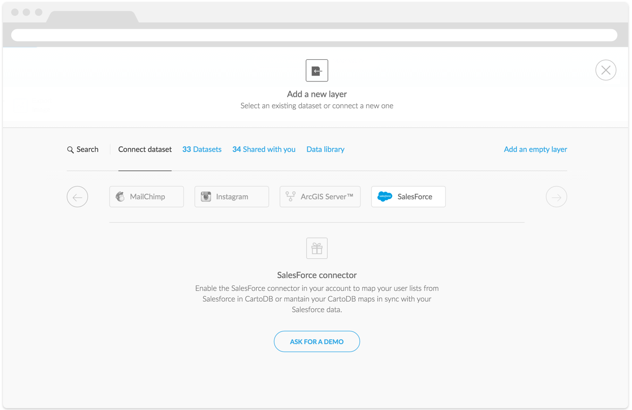
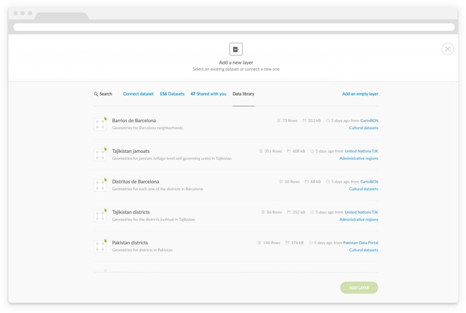
You’ve surely noticed that we’ve redone some parts of the web app to support some of our new features, so that creating maps is now easier, faster, and more straightforward than ever. As part of these improvements we’ve rebuilt the way you are able to add layers to your maps.
-
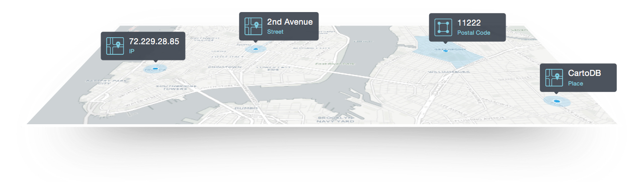
Sometimes datasets don’t contain any geospatial columns, but they have names, IP addresses, zip codes, or other information that can be translated into coordinates. CartoDB is able to assist you with this type of data.
-
Remember the days before cell phones, when you used to have to wait around at home to take a call? Or when the only way you could buy books, groceries, and clothes was by physically going to a store? Or when you had to select the best way to visualize your data on a map by clicking through various options yourself? No more.
-
A few months ago we announced our brand new free basemaps—Positron and Dark Matter—built with OpenStreetMap data and designed with the help of our friends at Stamen; your data will absolutely pop when using them.
-
With the deprecation of Google Earth API and Earth Enterprise we receive a lot of questions about how CartoDB can be a viable alternative to provide a 3D environment for geographical information. On this post we share with you a new iteration after our first post. Publishing 3D geodata with CartoDB and consuming it with Cesium makes a perfect match with all the benefits of a modern open web architecture based on reliable APIs and decoupled components.
-

In the high-speed world of data journalism it’s always important to stay on top of the latest story. Being able to quickly and beautifully visualize information in creative ways is essential! That’s why our team here at CartoDB is committed to not only providing the go-to world-class journalism mapping tool, but we’re also cultivating a journalism mapping community with efforts such as training sessions, journalism conferences and events, and now, our bi-weekly CartoDB JournoNewsletter!
-
In the second addition of our series on clever mapping with GDELT data (see this post from last week), we wanted to take on some more advanced mapping techniques. Again, we welcome Kalev H. Leetaru of the GDELT Project to explain how using geospatial information about journalism can build a better understanding of media in our world! Read on for more!
-
What would it look like to literally map the world’s news as it happens? What if you could reach across a growing fraction of the world’s news media every day, in real time, in 65 languages, and put a dot on a map for every mention in every article, in every language of any location on earth, along with the people, organizations, topics, and emotions associated with each place? That’s the vision that drives the GDELT Project.
In the wake of our GeoJourNews conference, celebrating journalists, cartographers and coders, we have an exciting partnership to announce with GDELT, one that we hope will only further support our community! We welcome Kalev H. Leetaru, a Senior Fellow at the George Washington University Center for Cyber & Homeland Security in Washington DC, to author a guest post demoing how CartoDB can be used to map the world’s news in real time!
-
Great news for everyone in the US Federal Government who loves maps! CartoDB has agreed with the General Services Administration (GSA), the agency responsible for coordinating procurement across all federal agencies, to a set of “federal friendly” Terms of Use for Federal government users. You might say we’re as wholesome as apple pie.

-

CartoDB is open by definition, so it’s about time we let you in on which one of the public maps you made is the most popular one at the moment. As you may be aware of, we at CartoDB love to challenge ourselves and experiment with different ideas that may end up leading to new endeavours. That’s what we do every Friday afternoon in our leapfrog sessions: team up to work on cool projects that aren’t part of our day-to-day tasks.
In one of this sessions a group of us came up with the idea of showing off the most-visited CartoDB map in an accessible and user-friendly way. That’s how the TrendMap idea was born and developed, and now we want to share it with everyone! If you’ve you ever wondered which CartoDB map is the most popular in real time, the TrendMap application is perfect for you.
-
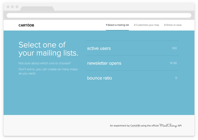
It’s time to get that marketing data analysis monkey off your back, and CartoDB is glad to help! We are excited to introduce the new MailChimp Connector, a feature that melds our mutual love of efficiency and awesome geospatial visualizations with the data captured by a leading Email Server Provider.
-

WMS! What, more stuff? We make software, with map standards: Web Map Server. That is to say, CartoDB now offers the possibility of making its visualizations viewable via the Open Geospatial Consortium (OGC) Web Map Server (WMS) and Web Map Tile Service (WMTS) standards. The newest, hippest maps on the web just got “old school”.
-

To say SharePoint is a popular enterprise software platform is a bit of an understatement. Having evolved over 15 years, SharePoint is used by over three quarters of the Fortune 500 and over 100 million users in all. SharePoint is often described as a document-sharing, intranet, and business collaboration platform, but really its functions are as varied as the organizations that use it.
As CartoDB grows in popularity with companies as a fully-featured enterprise geospatial platform itself, it was only a matter of time before our users would want to combine their CartoDB maps with their Sharepoint sites. They work together splendidly, we’re pleased to say, and we have recently published a short 10 minute tutorial on how to share your visualizations through Sharepoint. Enjoy!
-
Have you ever wrestled with iframes in responsive websites? What about resizing them after the page is loaded? Or maybe your site relies on consistently themed embeds from multiple services? If any of those or any other challenges of using map embeds on your platform sound challenging to you, look no further - CartoDB is now a supported Embedly endpoint.
-
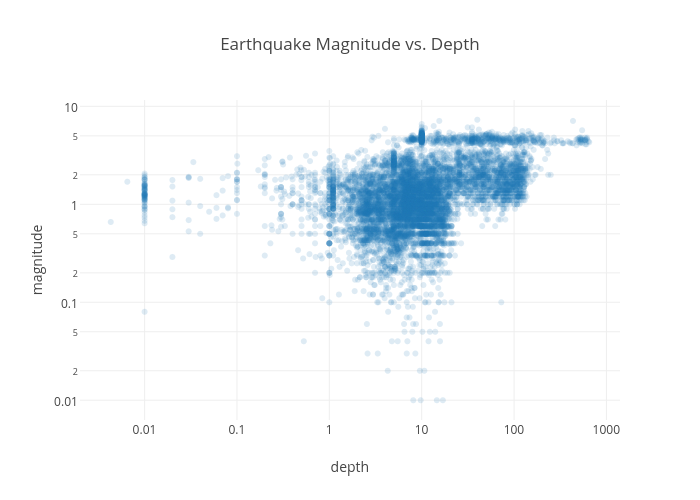
CartoDB, Plotly, and IPython notebooks work beautifully together. The plot above was made on Plotly from data imported into an IPython notebook using the CartoDB SQL API.
-
If you missed our Valentine’s Day blog post you may have also missed that CartoDB now has the ability to generate static images of dynamic maps from your accounts. Now we’ve added the capability directly to your CartoDB Editor. From any visualization, quickly generate static images to embed in your presentations, share over email, or anything else your heart’s desire.
-
This week marks a winter slurry of holiday occasions, including Lincoln’s Birthday (Wednesday), World Radio Day/Friday the 13th (Friday), Valentines Day (Saturday!), and Halfprice-Chocolate Day (aka, Sunday)! In the spirit of the latter (two), we celebrated this week with our community at Monday’s Geo-NYC Meetup, prefiguratively themed “Love Stinks.” Our plan was simple/typical: make some cool maps to give people hope this holiday season. Read on to learn how we did it.
-
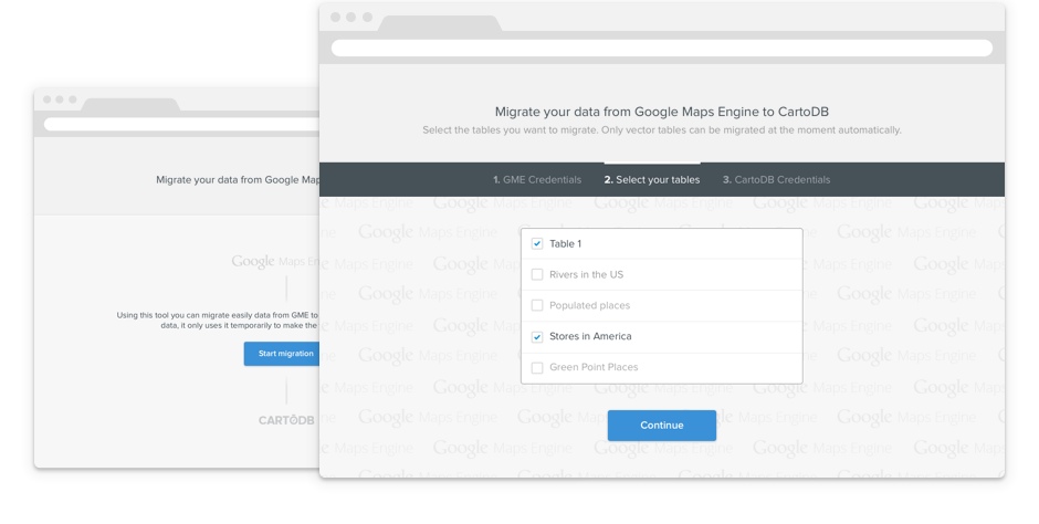
Recently, we announced the availability of CartoDB on Google Cloud Platform. Our intention is to provide a great resource for those projects making use of the Google Maps API and help former Google Maps Engine customers continue their projects into the future.
-
A common challenge we see facing our users is how to create dynamic maps with secure data. We have always had the ability to securely publish interactive maps from private data on CartoDB. Today, we go a step further. With the new Named Maps API, users can create dynamic maps, capable of being filtered and modified in front-end applications while maintaining the security of the data used to render those maps.
-
There doesn’t seem to be a day that goes by anymore without us seeing some far out data visualization using CartoDB. From modeling the Alcatraz escape routes to mapping the Starwars Galaxy our users know how to keep us impressed. Our goal in it all is to continuously make our platform easier to use and to give you the tools that make your maps shine. As part of that march forward, today we wanted to show off two new basemaps available in the CartoDB editor.
-

Like many of you know, building a startup is hard work. The CartoDB team is a product of this energy. Growing from a group of programmer friends with a desire to build technology for better communication–and to ultimately change the world–has taught us about what it takes to be successful innovators. Step one, obviously, is to believe in your mission. Step two is to make others believe.
-
Over recent years, mapping services have been busy counting and charging for map views. We believe that charging for map views is actually penalizing users for doing great things with their work. In order to change the trend, we are going to take a different tack, and promote the usage of maps, not discourage them. That is why we are no longer charging for map views. Yep, you read that right: free and unlimited map views for all CartoDB accounts. CartoDB exists so that you can make the most useful and inspiring visualizations on the web, so we figured it’s best that we stay out of your way.
-
We all need an assist when we’re thinking big. At CartoDB, we’ve seen some of the most original user visualizations inspired by common data. So, we’re focused on growing public data offerings to help you make maps that tell more creative and comprehensive stories.
-

Are you into creating beautiful maps? We thought so. Let’s talk about Stamen. They’re an award-winning, internationally known design and technology studio based in San Francisco’s Mission District (aka the West Coast Williamsburg). You may have heard of them, but you’ve definitely encountered their work if you keep up with newspapers, Fortune 500 brands, museum collections, and prime time television.
-

Yesterday we announced a significant milestone for this company: we have partnered with EarlyBird, Vitamina K, and Kibo Ventures to take CartoDB to a new level.
-

Earlier last month we released a beta version of Twitter Maps, which gives you the ability to map tweets directly from the CartoDB Editor. Today we are excited to announce the next phase of our Twitter Maps service: general availability for our Enterprise plan customers.
-

Today, we consume information primarily through mobile devices. From the start, CartoDB has supported visualizations on-the-go. We believe that form and function make a good pair, which is why our maps are designed to live with the technology that supports their creators. Our conviction was a hard-won technical challenge.
-
Creating maps is quite addictive, so you may end up with tons of tables and visualizations in your account that are part of publications, and which you don’t wish to change.
Today we are launching a new way to prevent undesired changes to your published items. From now on, you will be able to lock your tables and visualizations which will make them disappear from the default view of your dashboards and CartoDB will warn you each time you want to edit them.
-

The maps we have been seeing come from you lately have been amazing. We are seeing incredible projects like the Urban Reviewer, insanely popular Twitter maps, and the NGO Aid Map coming online everyday it seems. We love it and couldn’t be more grateful for such an awesome and inspiring community of users. Now, we want to make it easier for new users to see the full potential of CartoDB in your projects. Today we are announcing a 10x increase in space for free accounts! That’s 50MBs to start mapping for free! These changes are immediate, so if you are using a free account, you should be able to login and see the update right now.
-
Google Street View is a fantastic Google technology that provides panoramic views of many streets worldwide. The service has some really curious pictures, and everybody loves using it to look for a restaurant or a museum. It kind of provides the last meter from map to actual object.
-
Probably you have heard of Heartbleed already so we will keep this short. This is what what we did at CartoDB the following hours after the issue was announced (By Tuesday, April 8th 2014 at 11.00 UTC all our systems were free of this vulnerability)
-
Two new small improvements this week (watch our for bigger ones in the coming ones!!).
-
Yesterday, Knight Foundation announced that Vizzuality and CartoDB have received a grant to help build an open source tool for journalists that will enable better storytelling with maps online. We have long been advocates of storytelling using maps and data visualization and this grant will allow us to help make it easier for everyone. As part of the Prototype Fund, our project aims to simplify the process of combining narratives, maps, and interactions into a single web page.
-
For a while now, members of the CartoDB team have been following CartoDB related questions over on StackExchange. Already, we are starting to see some great questions and we are also seeing a good amount of community driven conversation. We think the StackExchange format has a lot more to offer our community, so we are officially starting to shift our free support questions to the GIS StackExchange site.
-
Basemaps tailored to data visualization
-
Earlier this fall we launched a new wizard that allows you to create Category maps with just a couple of clicks. You have all seemed to love the feature and have made it one of our most popular visualization types. Deep down inside though, we knew it wasn’t really complete (remember,we release early but we release often), so we’ve been working hard to get it finalized for you.
-
The speed at which new data is created on the web is mind boggling. Sources from Twitter to Dropbox are helping us organize everything from our thoughts to our spreadsheets. At CartoDB, we have been trying to help you organize your geospatial data and help you share the insights you gain from that data with the world. However, keeping up with the speed at which new data becomes available can be a daunting task.
-
We know it can be challenging to pick the right tools to create a successful project. Good developers, designers, and other map creators want to know that the tools they use will value to their work. They want to kick the tires, test the capacity, understand the limits. That is why we have always provided users with a free account tier. But what about testing our larger developer accounts? Today we are announcing our new free 14-day trial period for all Magellan plan upgrades.
-
We were very excited earlier this spring by the announcement that GitHub would be including interactive maps for small GeoJSON files stored in your repos. What a cool feature! It will definitely improve your repo and data management while also making it easy to share your geospatial data. If you haven’t had a chance to play with GeoJSON on GitHub on your own yet, take a look at this set of world borders inside the CartoDB repository,
-
Sorry, that title was too fun not to use. In reality, we aren’t talking about the rejected non-planet, we are talking about NYC’s latest open data release, the PLUTO dataset. The PLUTO dataset contains land use and geographic data for tax lots across the five boroughs. That’s 850,000 polygons! While not being exactly building-by-building footprints, tax lots are now among the highest resolution geospatial data available from the NYC open data portal.
-
We have designed CartoDB from day one to be an entirely cloud based solution for your mapping and data visualization needs. This gives us tremendous flexibility in the ways we can bring you speed, new features, and a better service all around. We take a lot of inspiration from other cloud services like Dropbox, the tool that has changed the way many of us share, store and organize our files. With nearly 200 million users worldwide, Dropbox services 700,000 file uploads every minute!
-
Almost since the first release of CartoDB a couple years back, we have regularly received requests for easier legends in embedded and shared maps. We understand fully where these people were coming from, heck, we wanted legends pretty badly ourselves. For a lot of the time in between, we have focused our small team on bringing you faster maps, easier visualizations, and improved publishing tools. So,we take it as a sign of just how far CartoDB has come that we finally integrated legends into the user-interface.
-
We have been working on the next big release of CartoDB for some months now. Affectionately given the title, 2.1, this release is really a major step forward for the platform. We have added in tons of new features, design and usability improvements, and most of all, multilayer support. Multilayer support, in combination with new filters, new style wizards, and CartoDB’s built in SQL and CartoCSS capabilities will give you the ability to make some of the web’s most amazing maps.
-
The last days we have been working with the Twitter team on a visualization about the impact of Wimbledon on the popular social network. You can read more about the data in their blog post. Twitter contains one of the most interesting geospatial datasets one the web; every time someone tweets and shares their location, new geospatial data is published. This allows others track everything from the popularity of specific topics within a region to the dynamics of how viral topics spread around the world.
-
As many of you already know, we have been working on the 2.1 version of CartoDB for several months now. In the upcoming release, we are incorporating multi-layer support, new visualization wizards, and a new and improved way to publish and save your visualizations.
-
A feature of CartoDB that makes it stand out from most other mapping platforms out there is the ability to create maps and build applications on top of data that grows and changes. The dynamic nature of the CartoDB stack is what makes it such a fun and powerful platform for so many of our users. Users that build applications or link CartoDB to their other technology, most often perform these updates and modifications through the SQL API.
-
March 15th is more widely known as the Ides of March, and the day that Julius Caesar was assassinated in the Roman senate. However for those of us in the mapping, data visualization and Epidemiology March 15th is the birthday of John Snow, an English physician and a leader in the adoption of anaesthesia and medical hygiene.
-
With the recent release of 2.0, you have probably noticed a our complete overhaul of styling features in CartoDB. In this post we are going to explore those features in detail. We’ll look at the changes to the user-interface and some of the great new styling upgrades that come with this release. Some things to look for below include, new point-and-click visualization, support for new CartoCSS methods, new the ability to add a third dimension to your polygons.
-
This Thursday, November 29th, we will be releasing our biggest update yet to CartoDB. What this means for you is that there will be a period of approximately 6 hours downtime on the 29th at 2AM EST where your dashboard will not be accessible (We will post again once the process is complete). This does **NOT **mean however, that your maps and visualizations will go offline. We’re upgrading in such a way as to keep all your work available.
-
From its very beginning, CartoDB has always been about making it easier for you to create map driven applications online.
-
We love R users, and for a while now we have known that R users would probably love CartoDB. Getting the two together has taken some time and our commitment to that goal is far from over. But today, we are happy to show off our first attempt at helping more R users to analyze and share their geospatial data, our new R package for CartoDB.
-
We are happy to announce you that CartoDB 1.0 is already live.
-
We’ve submitted a proposal to Knight News Challenge for a new project called StoryMap, an open source tool to easily create visualizations based on a narrative on map. You can read the full description of the project here, and vote or comment if you like it.
-
At CartoTowers, we’ve been hard at work preparing some new thematic map visualization options for you to use in CartoDB: Choropleth and Bubble maps. For those of you new to mapping, here’s a quick summary of these two popular cartographic techniques:
-
This week we wrote a few new examples in the CartoDB Gallery. One of the examples was to show off a feature that allows you to set styles through the URL. Until recently, setting Carto styles in CartoDB required the use of the Developer Console, but now with a bit of new functionality and some sweet new caching, it is possible to set styles through your Maps API URL request. For example,
-
Take a sneak peek at some upcoming functionality to CartoDB: Indexed nearest neighbour search. Thanks to CartoDB investment in PostGIS 2.0, you can now find the nearest N things to anywhere on the planet at ultra fast speed!
-
This has been a crazy week for CartoDB. We presented the platform at last FOSS4G in Denver and since then the response from users had been great.
-
We often find ourselves needing a simple, high speed and decoupled map tile server to generate maps from PostGIS as fast as possible without sacrificing developmental flexibility.
-
Hi all, we are very excited to start the new CartoDB blog. CartoDB is a a geospatial database on the cloud to help you develop location aware applications quickly and easily.