Map of the Week: Interactive Air-Pollution Map
We welcome Pedro Cuhna to our Map of The Week series. He’s a developer currently working in Startup Institute as a freelancer. Check some of his work here.
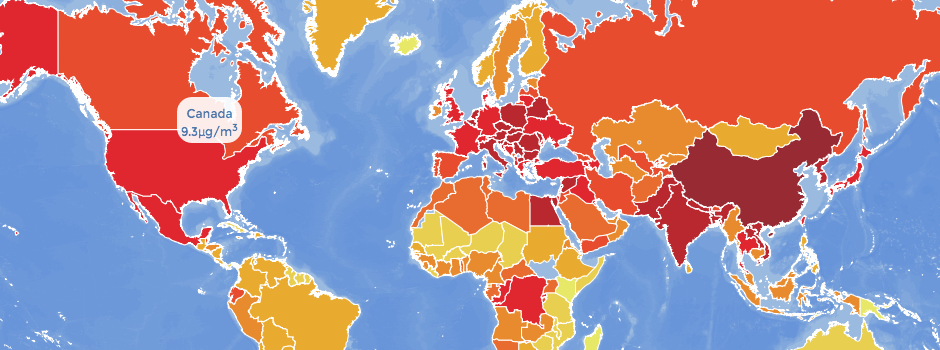
Cunha created an interactive map with Dmitry Pavluk, Anna Young, and Diego Torres Quintanilla to provide a baseline understanding of air pollution around the world. The map was published by The Atlantic magazine
This blog post summarizes how they managed to build this map.
The project
It was a warm day at the EcoHack hackathon, which took place in the Brooklyn offices of Etsy. My team and I were huddled around a table that was scattered with Macbooks. We delegated the work between three smaller teams. One team worked on creating an API, the other team did the data mining, the heart of this hackathon, and my team worked on the visualization of this data.
Dmitry Pavluk, a self-proclaimed data nerd, helped me with building the map. Our first choice was a color layout that would present the data in a beautiful and interpretive way. We chose a color scale that ranged from beige to red because it provided a good contrast for our data. We started out by using the CartoDB web application. We imported all of the geolocation data and made a rough mockup of what the map would look like. This data consisted of two main components: the world borders to delimit countries, and the data provided by the WHO on particulate matter levels in countries and cities. More on cities later.
Once we had an idea of what it would look like we started to develop alongside the CartoDB library. We wanted something that was dynamic, that could tell the alarming story of pollution around the world. The development process can be divided into two main tasks: importing and wrangling the data in the CartoDB application, and exporting that data into javascript and making it presentable as a web app.
Creating the bathymetry
Andrew Hill, from CartoDB, hinted that we should try out a layer of bathymetry as the ocean for the map. We created the bathymetry layer that served as a base layer for our map by using a textured image. You can create these base layer images by using a nifty little application called TileMill. Once you have your image all you need to do is upload it to the CartoDB application:
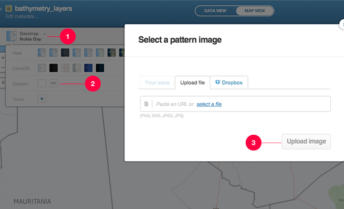
After you upload your image you can play around with the settings (opacity, color and etc) to get the desired aesthetics. After saving the layer you just need to instantiate the map in your javascript. Below is a snippet of code that did just that:
cartodb.createLayer(map, {
user_name: 'dmonay',
type: 'cartodb',
sublayers: [{
sql: "SELECT * FROM bathymetry_layers",
cartocss: "#bathymetry_layers{ polygon-fill: #598cdb;polygon-opacity: 0.2;line-color: #FFF;line-width: 0;line-opacity: 1;}"
}, {
sql: "SELECT * FROM pm25_na",
cartocss: $('#pm25_na').html().format('pm25_2000'),
interactivity: "cartodb_id, the_geom, pm25_2000, pm25_2001, pm25_2002, pm25_2003, pm25_2004, pm25_2005, pm25_2006, pm25_2007, pm25_2008, pm25_2009, pm25_2010, pm25_2011, pm25_2012, country"
}, {
sql: "SELECT * FROM who_georeferenced_clean",
cartocss: $('#cities').html().format('city_station'),
interactivity: "city_station, pm_2_5, country"
}]
}).done(function(layer) {
// add the layers to our map
map.addLayer(layer);
sublayer_country = layer.getSubLayer(1);
sublayer_country.setInteraction(true);
sublayer_city = layer.getSubLayer(2);
sublayer_city.setInteraction(true);
createSelector(sublayer_country);
createSelector(sublayer_city);
sublayer_city.hide();
//create infowindow
sublayer_city.infowindow.set('template', $('#infowindow_template').html()).on('error', function() {
console.log("some error occurred");
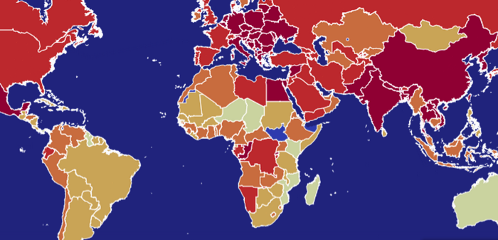
});As you can see from the code we pulled the bathymetry layer first and put in the CSS generated by the CartoDB application. After that we pulled in the rest of the data from the other tables and their corresponding CSS. We’ll talk about the sublayers in the next section. Here is what the map looks like with the Bathymetry:
Notice that we used the choropleth method of displaying the pollution data. This method is best suited to data that is distributed on a spectrum. We will use the same method to represent pollution in cities once we add that data as a sublayer. Now we will move on to exporting the data into an html file.
Exporting data
There are a couple of different ways to display the data you create in CartoDB. It can be shown right from CartoDB, it can be inserted as an iFrame, or it can be embedded into the code manually. The former is the most automatic and fixed and the latter the most manual with the most styling options. We chose the latter.
We accessed the data we created on cartoDB through an API call built into the cartoDB.js library. This consisted of including the username and calling the correct table:
//Formats the columns for us into css
String.prototype.format = (function (i, safe, arg) {
  function format() {
    var str = this,
        len = arguments.length + 1;

    for (i = 0; i < len; arg = arguments[i++]) {
      safe = typeof arg === 'object' ? JSON.stringify(arg) : arg;
      str = str.replace(RegExp('\\{' + (i - 1) + '\\}', 'g'), safe);
    }
    return str;
  }

  //format.native = String.prototype.format;
  return format;
})();
We then referenced the three layers that we would like to use. Don’t be thrown off by the SQL syntax - cartoDB provides it for you on their web app.
Adding Sublayers
Although the bathymetry layer is considered the base layer, technically it is a sublayer of the map (layer 0). When the map was generated we told CartoDB to also retrieve two other layers that rest on top of the base layer. The first is the layer that holds the data for countries and the second is a layer that holds the data for the cities. After the map makes the calls to the database we set variables equal to the sublayers in order to retrieve them easier.
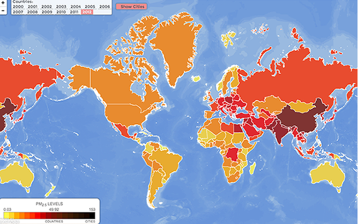
If you further examine the code you can see that the layers are actually database sets that are pulled from the table pm25_na when we instantiate the map. pm25 stands for particulate matter with the size of 2.5 microns; particulate matter comes in many sizes and that of 2.5 microns is the most dangerous as it is the finest and can cause the most serious harm to the alveoli of the lungs.
Setting up Layer CSS
Something very useful that Andrew Hill showed us was that we could call the CSS from a script tag that was identified with an id. Setting up the css for layers with multiple data sets is a pain but with this method it’s made simpler.
{
  sql: "SELECT * FROM pm25_na",
  cartocss: $('#pm25_na').html().format('pm25_2012'),
  interactivity: "cartodb_id, the_geom, pm25_2000, pm25_2001, pm25_2002, pm25_2003, pm25_2004, pm25_2005, pm25_2006, pm25_2007, pm25_2008, pm25_2009, pm25_2010, pm25_2011, pm25_2012, country"
}
You probably recognize the code above. That’s right, it creates a sublayer. Now notice how the cartocss is targeting an id of pm25_na. Although it looks strange it’s actually very convenient.
<script type="cartocss/html" id="pm25_na">
  /*Country Styles*/
  #pm25_na{
    polygon-fill: #FFFFB2;
    polygon-opacity: 0.8;
    line-color: #FFF;
    line-width: 1;
    line-opacity: 1;
  }
  #pm25_na [ {0} <= 154] {
    polygon-fill: #000000;
  }
  #pm25_na [ {0} <= 140] {
    polygon-fill: #1A0800;
  }
  #pm25_na [ {0} <= 125] {
    polygon-fill: #241105;
  }
  #pm25_na [ {0} <= 110] {
    polygon-fill: #301703;
  }
  #pm25_na [ {0} <= 90] {
    polygon-fill: #3F1C05;
  }
  #pm25_na [ {0} <= 69] {
    polygon-fill: #4D1E04;
  }
  #pm25_na [ {0} <= 55] {
    polygon-fill: #631E04;
  }
  #pm25_na [ {0} <= 49.92] {
    polygon-fill: #791406;
  }
  #pm25_na [ {0} <= 32.54] {
    polygon-fill: #970707;
  }
  #pm25_na [ {0} <= 25.17] {
    polygon-fill: #c30000;
  }
  #pm25_na [ {0} <= 15.17] {
    polygon-fill: #f50000;
  }
  #pm25_na [ {0} <= 10.85] {
    polygon-fill: #FF3200;
  }
  #pm25_na [ {0} <= 9.15] {
    polygon-fill: #FF5a00;
  }
  #pm25_na [ {0} <= 8.15] {
    polygon-fill: #FF8200;
  }
  #pm25_na [ {0} <= 6.06] {
    polygon-fill: #FFaa00;
  }
  #pm25_na [ {0} <= 4.62] {
    polygon-fill: #ffd72d;
  }
  #pm25_na [ {0} <= 2.98] {
    polygon-fill: #fff74b;
  }
</script>
Above is the script tag with the id we mentioned above. Using jQuery, which cartoDB provides for you when you include it in your page, we target the script tag and convert it to HTML. Then we pass the converted HTML through a function that loops through the arguments and replaces the {0} expression with the column number. This was the trickiest part of the entire process, in my opinion. The layers, from the frontend perspective, are just different instances of CSS. So for each new layer, we had to generate new CSS, which was done with this looping function:
//Formats the columns for us into css
String.prototype.format = (function (i, safe, arg) {
  function format() {
    var str = this,
      len = arguments.length + 1;

    for (i = 0; i < len; arg = arguments[i++]) {
      safe = typeof arg === 'object' ? JSON.stringify(arg) : arg;
      str = str.replace(RegExp('\\{' + (i - 1) + '\\}', 'g'), safe);
    }
    return str;
  }

  //format.native = String.prototype.format;
  return format;
})();
Notice the difference between the styling of the cities layer and the countries layers: the former has the column name hardcoded–pm_2_5–while the latter has it set to {0}, which allows the looping function to return the correct column name based on user input.
Later on in the script we begin using the variables, col1 and col2, to switch between the layers.
We reused this format function on some of the click event handlers to toggle the layers.
Final Touches
The final touches consisted of some polish to the map’s UI/UX. We added a tooltip that showed the data underneath the choropleth. It consisted of a simple set of event handlers thanks to jQuery. We then created a menu that helped users flip through the different sublayers. We wanted to make it friendly and out of the way so that it didn’t block the users’ view of the visualization. Eventually we decided it would be vital to provide some information about the map. We created a slider that a user could toggle if they wanted to see information about the map and its contents.
Jump into CartoDB.com, create a free acount and start creating maps like this one.