Torque: Big data meets time-based maps, bundled with CartoDB 2.0
At CartoDB, it is our goal to give our users the tools necessary to create compelling visualizations with their data. We are continuously looking for new innovative technologies that will enable data-driven storytelling.
Visualizing Big Data on maps presents a tough set of challenges. A lot of our work focuses on how to make it easier while maintaining flexibility. Perhaps the hardest challenge we face, is how to visualize temporal data on maps. It adds the obvious difficulties of dimension and non-static content, not to mention transfer size. We are developing performant solutions for time based maps that will be included in the upcoming CartoDB 2.0.
These tools we are building into CartoDB will lower the bar for any of our users to make better dynamic temporal maps of their data. Today, we want to share some of the technology we are using to do this.
Introducing Torque
Torque allows you to create beautiful visualizations with big temporal datasets by bundling HTML5 browser rendering technologies with a generic and efficient temporal data transfer format created using the CartoDB SQL API. Torque visualisations work on desktop and ipads, and work well on temporal datasets with hundreds of thousands or even millions of datapoints. In anticipation of the Strata Conference starting this week in London, we have prepared some examples to share. Simon Tokumine will be there, so ping us for a private demo there.
Now let us show you some examples.
A time-based map of 1 million naval ships locations during WWI
Inspired by the excellent work of Philip Brohan, we’ve worked on a time-based visualization specially for StrataLondon rendering the 1 million naval ships locations during the period around the first World War. This visualisation is being published today by The Guardian in their Data Blog.
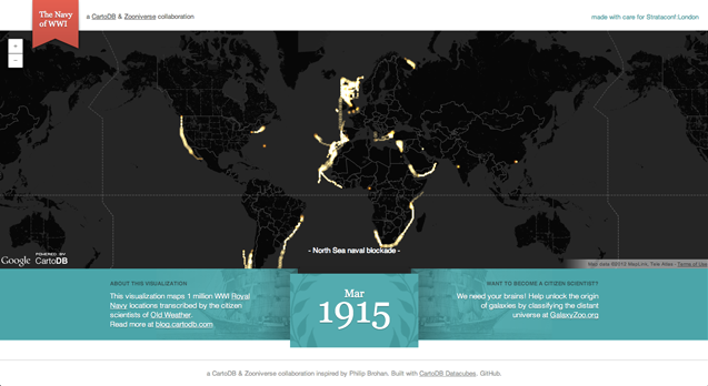
By adding the subtitles, the temporal map of naval history really puts a lot of the spikes and bursts of activity in perspective. The labels are not currently something built into the library, but we will work on it in the coming weeks. We couldn’t even fit all the neat things we saw, passing through the Panama Canal, explorations up rivers in China, trips across the Pacific. What other neat things do you see in this incredibly cool history?
Map of Post Offices
Another great example we quickly put together is a recreation of Derek Watkins’ map of US Post Office locations through time, now done on the fly and in the browser. This example makes the most of Torque’s ‘cumulative’ mode, building up a density map of post offices over time. You can even see the post offices following the railroad in the midwest.

Visualizing how OpenStreetMap was created by volunteers over time
Torque can also be used to explore datasets. We are very excited about the combination of Open Street Map history and Torque for visualizations; we will add more about this in a later post and will be showing some of this at the upcoming State of the Maps USA conference in Portland. This map represent all the historical edits of OSM in Madrid.

We are very excited about the possibilities of this new technology. By releasing it Open Source we hope other people will get excited as well, we’ll be cleaning up the code over the coming weeks. For the time being you will need to do a bit of programming to get to do your own visualization like this, but the good news is that you can already do it with the current CartoDB. When we release CartoDB 2.0, Torque will be available and by just doing a few clicks you will be able to create astonishing visualization like this. We can’t wait to see what people build with it.