-
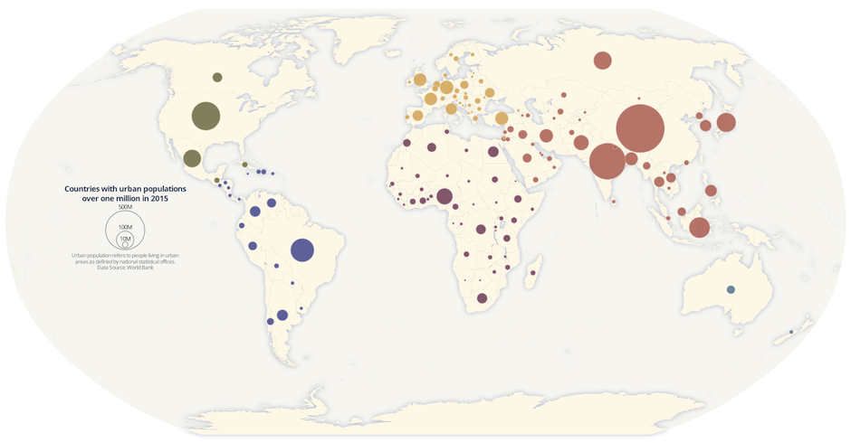
Proportional symbol maps are used to represent point data that are attached to a specific geographic location (like a city) or data aggregated to a point from an area (like a state). The area of each symbol on the map (usually a circle) is scaled according to its value at a given geographic location using either absolute scaling or range-grading. The result is a map where larger symbols indicate higher values and smaller ones, lower values. This type of map is flexible in that you can represent raw data values (total population) or data that are normalized (percentage of population).
In this blog, I’ll walk through the basic principles of proportional symbols and some best practices when designing them. Then, I’ll cover the steps to make a map of 2015 urban population by country using the absolute scaling method.
-

Last week’s Partner Summit was a smash hit! With representatives from more than 50 partner companies, ranging from small geo-consulting firms to large systems integrators to other SaaS businesses, this two-day event had all the right voices. Here’s a quick recap and some thoughts on the future.
-
When Charles O. Paullin and John K. Wright created The Atlas of the Historical Geography of the United States in the 1930s, they made the best atlas they could given the tools at their disposal. Standing on the shoulders of giants, they could see further than this, and dreamed aloud that “the ideal historical atlas might well be a collection of motion-picture maps, if these could be displayed on the pages of a book without the paraphernalia of projector, reel and screen,” but didn’t have the technology to make it happen in the 1930s.
Today we have that technology. The University of Richmond’s Digital Scholarship Lab and Stamen Design, with the support of Andrew W Mellon Foundation, have launched a new project, called American Panorama, that aims to realize that vision of the “ideal historical atlas”. American Panorama includes a new suite of data visualization tools for students, scholars and researchers to easily create data-rich, interactive maps of change over time and space.
-
Location data is paramount to intelligent cities planning and development. Geographical information provides a common frame of reference and big picture analysis for entrepreneurs, citizens and policymakers alike.
-
Planet Labs, Github, Vizzuality and CartoDB, have come together to use #LoveEarth to motivate communities on Facebook and Instagram and, to amplify the social movement around global climate change and the Paris Climate Summit - COP21, which will be convening leaders from all around the world.
-

We’re excited to introduce our newest addition to our Board of Directors. Anthony Deighton hails from Massachusetts and has over 10 years of experience in the visual analytics industry.
-
Data-driven visualizations are a compelling method to engage audiences in some of the most unconventional ways. How exactly does charting the musical preferences of your global users turn into one of the most web trafficked visualizations on your platform?
Spotify, an award-winning digital music service, fused geographic analysis and user data to discover musical trends all around the world and increase brand awareness through a cost effective solution!
-
You don’t need a DeLorean to drive into the future of big data. Join Sergio Alvarez at El País con Tu Futuro in Madrid, where he is giving a talk titled
Back to the Future on Thursday, December 17. -

Earlier this year we announced a pizza-love fueled commitment to supporting our worldwide Maptime communities. From our very own Maptime meetup in New York City, we found that the best way to inspire great work and foster community was by coming together around the workspace table and whirring laptops to enjoy delicious pizza and talk maps. We wanted to make this experience a worry-free staple in everyone’s Maptime meetup. This is why we committed to donating every pizza, for every Maptime, everywhere for a whole year, and we’re only half way done!
-
Our very concept of place is shifting as digital information layers and enriches the physical world. The streams of digital data generated by our daily lives tell stories and offer rich context and insights. Location intelligence offers views into our environment that has become encoded with new meaning and messages.


